
The Sonos App Fix: A Long-Delayed Course Correction
The Sonos app redesign is a phased software update to Sonos’s companion app that introduces clearer tab navigation, new speaker sorting and ordering tools, and a Dynamic Volume Slider on iOS, aiming to fix the widely criticized user experience introduced by a previous redesign that disrupted usability so severely the company reportedly delayed new hardware to address it.
This is not cosmetic polish; it is a belated admission that the “disastrous redesign” from two years ago broke the app to the point of undermining Sonos’s hardware roadmap. By starting to roll out a significant companion app update with tabbed navigation and speaker sorting options, Sonos is trying to rebuild trust with users who have spent years complaining that the software side of their multi-room audio system felt hostile to everyday use. The update is live now but will reach everyone over roughly two weeks, underscoring both the scale of the install base and Sonos’s caution after its last misstep.
Navigation Finally Prioritized: Tabs, Clarity, and Opt-In Control
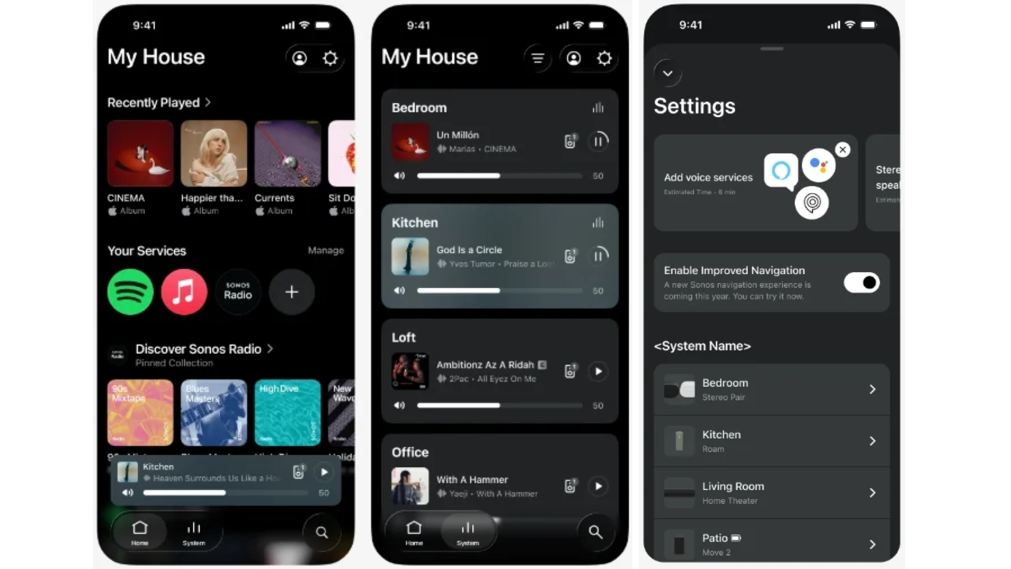
If the previous Sonos app made basic tasks feel like an obstacle course, the new app navigation improvements aim to flatten that maze. The updated bottom bar now surfaces clear buttons for Home, System, and Search, with more obvious highlighting of whichever section is selected. This tabbed interface is not forced on users: Sonos has made it opt-in, gated behind an “Enable Improved Navigation” toggle in settings, a cautious move that reflects how badly the last redesign went over.
Opinionated design is finally working in the user’s favor. By anchoring navigation around the three sections people actually use, Sonos is acknowledging that its app is a tool, not a showroom. Early feedback even notes faster search performance on Android, hinting that the update quietly tackles responsiveness as well as layout. According to Sonos’s Reddit post, this is “a big one,” with interface improvements at the core of the release. It’s telling that the company is actively asking for feedback there, suggesting this redesign is meant to evolve instead of calcify as another problematic overhaul.
Speaker Control Update: Sorting the Chaos of Multi-Room Audio
For many Sonos owners, the biggest pain has been managing a growing sea of speakers and rooms. The new speaker control update shows Sonos finally takes that frustration seriously. Inside the app, users can now reorder speakers and rooms directly, sorting alphabetically, by frequency of use, or by which devices are actively playing audio. You can also pin favorite speakers to the top for quick access, turning an unwieldy scroll list into a curated control panel.
This is the kind of mundane, practical change that matters more than any flashy visual refresh. A multi-room system lives or dies on how quickly you can find “Kitchen” or “Office” and change what they’re doing; years of clumsy device lists made Sonos feel more complex than it needed to be. Now the app is adapting to how people actually use the system, rewarding the speakers you touch most often and foregrounding what is playing right now. Combined with swipe-to-delete for Sonos Favorites and a Now Playing screen that responds to album art with changing background colors, the update quietly restores a sense of control and coherence to everyday listening.
Dynamic Volume and the Reality of a Phased Rollout
On iOS, Sonos is pairing structural fixes with a more tactile, legible way to adjust sound. The new Dynamic Volume Slider grows when you interact with it and can display the current volume level within the slider itself, so you see precisely where you are instead of guessing at a tiny handle. It can also show an EQ shortcut when enabled, promising a more responsive feel while you fine-tune levels. This is a rare case where interface flair serves clarity instead of distracting from it.
The catch is timing. The Sonos app fix is rolling out in phases, and the company says it could take up to two weeks for the update to reach all users on iOS and Android, with the expectation that many will see it sooner. Automatic app updates will handle the process for most people, though iPhone owners can also manually check the store. A slow rollout is sensible after such a troubled history, but it also means that, for now, the Sonos experience is split: some households will enjoy the improved navigation and controls, while others remain stuck with the version that caused so much anger.
Does This Redeem Sonos’s Software, or Just Stop the Bleeding?
This update is less a triumph than a necessary repair. Sonos broke its app badly enough that it reportedly had to delay hardware launches, and the company has spent two years living under that shadow. The new Sonos app redesign—with tab navigation, speaker sorting, improved Now Playing visuals, and Dynamic Volume on iOS—directly answers many of the most persistent usability complaints. It suggests Sonos finally accepts that its software must be as dependable as its speakers, not an afterthought that loyal customers work around with third-party tools.
Whether this marks a true cultural shift inside Sonos will depend on what happens next: will the company keep iterating and listening, or treat this as a box checked? For now, the phased rollout over roughly two weeks signals a measured approach. For users, the takeaway is simple: the Sonos app is no longer an obstacle by design. It may not be perfect, but this redesign finally aligns the software with the promise of the hardware—and that, more than any new feature, is the fix people have been waiting for.