
A Long-Overdue Shift: From Eye Candy to Safer Controls
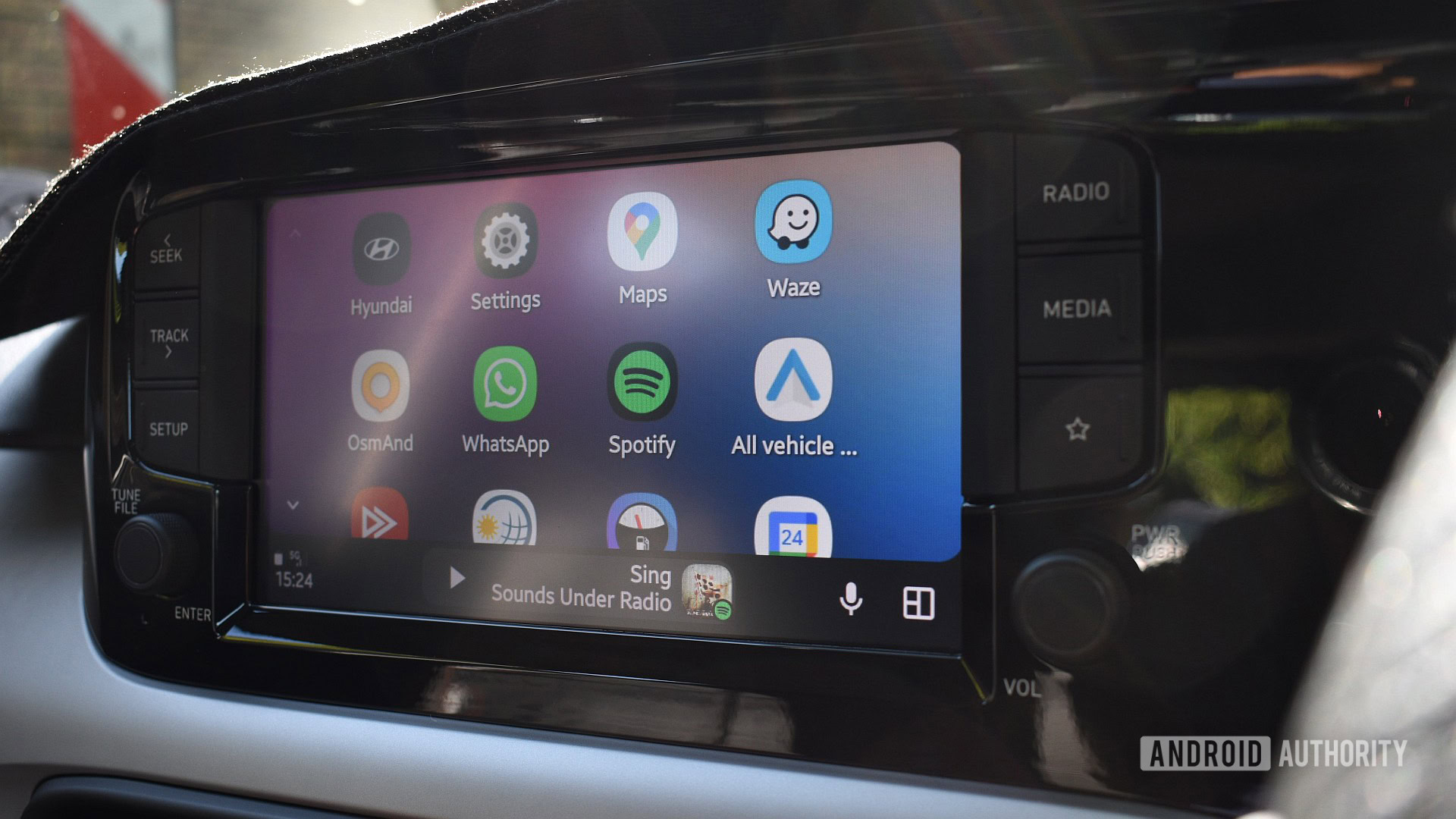
The redesigned Android Auto media player is a dashboard update that centers album artwork, adds a blurred background, and surfaces more in-car controls to make managing music while driving faster, clearer, and less distracting. Android Auto is testing a redesigned dashboard media card with centered album art and a blurred background, and that visual tweak signals a deeper change in priorities. The new layout swaps the current oversized album art for a more compact presentation that prioritizes playback controls over decoration. This move is not cosmetic; it is about cutting the number of taps and the amount of time drivers spend hunting for basic media actions while a car is moving. It is also one of the first visible signs that Google’s broad Android Auto makeover announced at I/O 2026 is finally starting to land in real cars.
Centered Art and Blurred Backgrounds: Cleaner, Calmer, Less Distracting
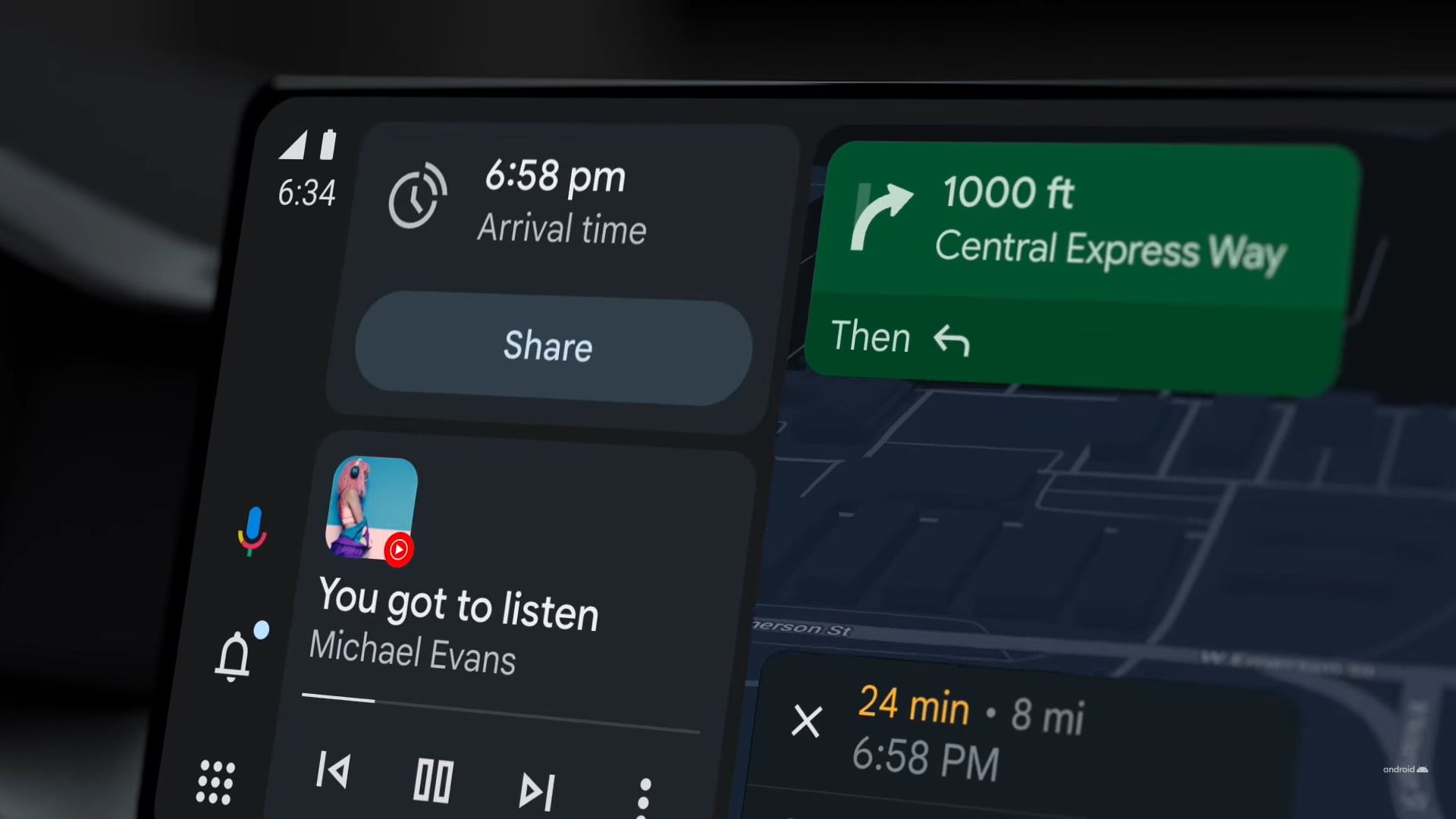
An APK teardown shows that the new dashboard media card gives album artwork a conventional home in the center, using its colors to create a blurred background around it. Track title and artist details move beneath the art and are centered too, which makes the card look less busy than the current full-bleed album cover treatment. The background is still a blurred version of the album art, but in this design it becomes a soft backdrop instead of a loud focal point. That matters in a car, where every extra visual detail competes with the road for attention. By reducing clutter, the dashboard redesign turns the Android Auto media player from a showpiece into a calm, legible panel that can be glanced at instead of stared at. This is the first time in a while that the interface design has clearly favored driver focus over visual flair.
Smarter In-Car Controls: Fewer Taps, More of What You Use
The real win in this media player update is what happens to the in-car controls. The redesigned card can add more playback controls directly on the dashboard, including buttons such as like, shuffle, and repeat, depending on the music app in use. The new layout adds quick-access buttons like Like, Shuffle, and Repeat, with the exact controls changing according to the media app you are using. In addition to the standard play, pause, and track skip buttons, Android Auto could also show app-specific shortcuts such as Like, Shuffle, and Repeat. According to one analysis, the current design can require opening the full app just to access commonly used features. That friction has been a long-standing complaint: no one should have to dig through menus to shuffle a playlist at highway speeds. The new card tackles this head-on by putting the most frequent actions within a single glance and a single tap.
A Partial Fix: Hardware Gatekeeping and What Comes Next
There is a catch: not every car will see the full set of new in-car controls. Whether additional buttons appear depends on the head unit’s display density, with larger or higher-DPI screens able to fit the extra controls. The expanded controls appear to be limited to vehicles with larger infotainment displays, leaving smaller screens with a simplified layout. In those roomier layouts, the play or pause button also moves into a more central position for easier reach. This change only affects the media card shown alongside navigation on the Android Auto dashboard, while opening the media app in full-screen mode still brings up the existing player interface. For now, the new media player remains hidden in recent Android Auto builds with no official release date, and as with many experiments, there is no guarantee it will ship in its current form. Still, given Google’s I/O 2026 roadmap and the direction it has signaled, this dashboard redesign is likely to reach drivers sooner rather than later.
Why This Update Matters for Everyday Driving
This media player update is not a minor visual refresh; it is a safety upgrade hiding behind a prettier card. Google seems to be rolling out a major usability upgrade to the media player in Android Auto’s dashboard interface, swapping out the oversized album art for quicker access to playback controls. That change could make controlling music in the car noticeably faster with fewer taps and less time spent hunting for the buttons you use most. A better dashboard redesign, smarter in-car controls, and a calmer blurred background together aim to make in-car media management safer and more intuitive, especially when navigation is running alongside the player. Google has been slowly rolling out interface changes announced at I/O 2026, including Immersive Navigation in Maps, and this card fits neatly into that larger push. The company is finally treating the Android Auto media player as a driving tool first and a design canvas second, which is exactly the order it should have followed from the beginning.