
A Long-Overdue Android Auto Redesign, Centered On What Matters
The upcoming Android Auto media player redesign is a dashboard interface update that replaces oversized, full-background album art with a centered artwork card, clearer track information, and expanded playback controls, aiming to improve in-car usability by putting common actions within easier reach while driving and reducing the need to open full-screen apps for basic tasks. This change is not a fresh rumor; it is already hiding in recent Android Auto builds, where a teardown and manual activation reveal a revamped media card on the dashboard. In other words, Google is not experimenting in the abstract—it has concrete, testable code that reflects a deliberate shift in how drivers should control audio on the road. And that shift finally acknowledges what users have been complaining about for years: in a car, controls matter more than decoration.
What’s Actually Changing On The Dashboard Media Card
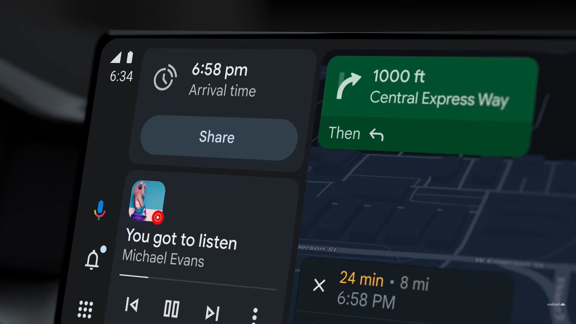
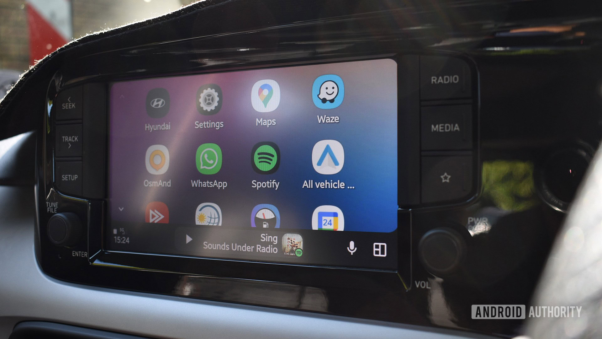
The current Android Auto dashboard media card turns album art into a full-size background, layering text and controls over the image. The redesigned media card instead places the artwork in the center, uses its colors to create a blurred backdrop, and moves the song title and artist beneath the image in a tidy, centered stack. This sounds cosmetic, but it is more than a fresh coat of paint. The card becomes more compact, less visually noisy, and more predictable at a glance. According to Android Authority, the player still keeps Google’s newer squiggly progress bar and updated primary buttons, but the visual hierarchy now highlights the track first, then the controls, rather than letting an aggressive background compete for attention. It is a subtle concession that design in a car should be calm and legible before it is flashy.
Controls Over Chrome: Why This Media Player Update Matters
The most important part of this Android Auto redesign is not the centered art; it is the upgraded dashboard controls. The new layout adds extra playback buttons—like, shuffle, repeat, and other app-specific shortcuts—directly on the media card, alongside the standard play/pause and skip controls. Today’s design often forces drivers to open the full media app just to shuffle a playlist or mark a track, a workflow that is outright hostile to real-world driving. By prioritizing control density over wall-sized cover art, Google is finally treating music playback as a safety feature, not a showroom for album design. The practical impact is obvious: if this interface rolls out broadly, it should make controlling music in the car faster, with fewer taps and less hunting for the buttons you use most. That is the kind of quality-of-life change that actually matters at highway speeds.
The Hardware Catch: Bigger Screens Get More Dashboard Controls
The redesign comes with a familiar Google caveat: the best experience is partially gated by hardware. The expanded set of dashboard controls only appears when the car’s head unit has enough display density; larger or higher-DPI screens can fit the extra like, shuffle, and repeat buttons, while smaller displays fall back to a simpler layout. On those larger layouts, the play/pause button also moves into a more central position, tightening the ergonomics for quick taps. This split approach is defensible on one level—tiny panels cannot safely host a crowded control grid—but it also underlines an awkward reality of modern in-car interfaces: two drivers using the same media app may get very different levels of convenience based solely on the trim of their vehicle. That unevenness is better than no upgrade at all, but it does blunt the promise of a universal Android Auto redesign.
Part Of A Bigger In-Car Interface Overhaul—And What Comes Next
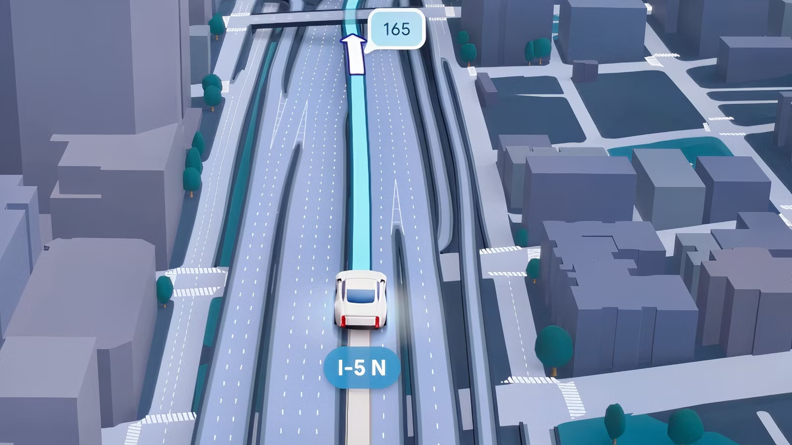
This media player update is not an isolated tweak; it is one more step in a broader Android Auto makeover Google announced at I/O 2026. Swipeable media cards and a new Immersive Navigation mode in Maps—with 3D buildings and clearer road features—are already starting to reach drivers, and the refreshed media card is the logical companion to that navigation-first dashboard. For now, the new player remains hidden in recent builds, accessible only through APK teardown methods, and there is no official release date. As with any work-in-progress feature, Google may revise the design or decide not to ship it at all. But given the direction it has publicly outlined for the app, this looks less like a throwaway experiment and more like an inevitable evolution. When it does arrive, the real test will be simple: does it keep your eyes on the road and your hands off full-screen menus?