
Android 17 Taskbar: A Small Change With Big Consequences
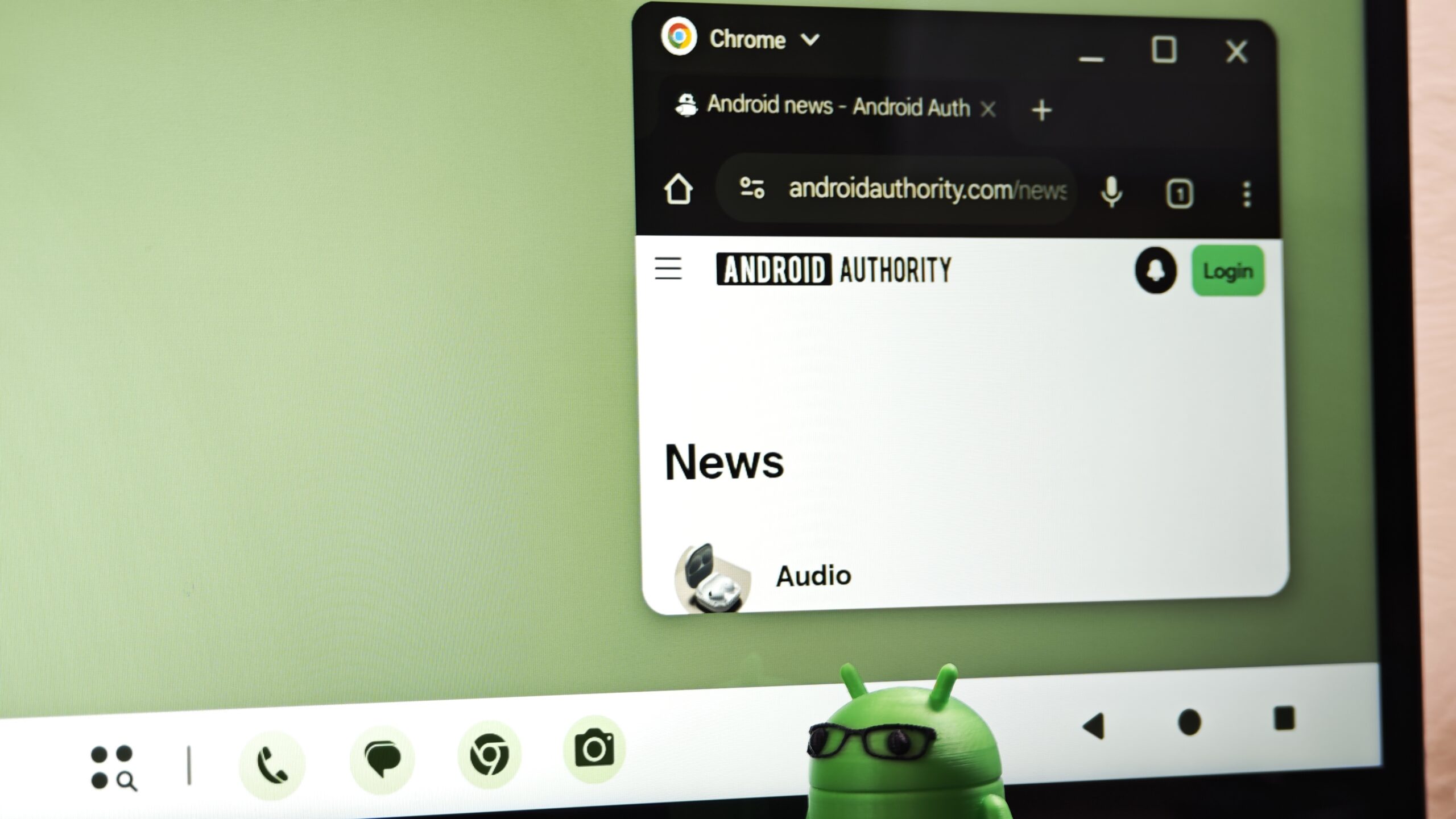
The Android 17 taskbar in the QPR1 Beta is a redesigned app strip on big-screen devices that replaces shifting AI-based predictions with a stable list of your most recently used apps, locking the last two active apps on foldable devices to streamline multitasking, reduce friction from hunting in the app drawer, and make the interface more predictable and trustworthy for everyday workflows. This is the rare software tweak that feels obvious the moment you see it. The latest Android 17 QPR1 Beta no longer shows predicted apps at the end of the taskbar dock; instead, it displays your most recently opened apps so the interface behaves in a much more predictable way. Google’s Android community engagement lead, Mishaal Rahman, confirmed the change and shared a clip of the new behavior, underscoring that this is a deliberate design pivot away from opaque suggestions toward transparent recency.
Why Recent Apps Beat Algorithmic Guesswork
Replacing predictions with recent apps is not a cosmetic tweak; it’s a correction of a flawed idea. Previously, apps that Android thought you might want next lived on the right side of the taskbar, but because those predictions kept changing, it was almost impossible to build muscle memory around them. Occasionally they helped, but more often they forced you to read the bar each time instead of tapping by habit, slowing down what should be a sub‑second action. The new recent apps multitasking design says out loud what users have implied for years: recency is more useful than guessing. Android 17 QPR1 Beta now shows the last two apps you actually used on a foldable phone, echoing how desktop operating systems prioritize recently used windows over algorithmic magic. According to Mishaal Rahman, this change is already live for testers in the QPR beta track.
Foldable Devices and Tablets Finally Get Respectable Multitasking
Big screens expose every flaw in mobile UI design. On foldable devices and Android tablets, scrolling through the app drawer has long felt like an unnecessary speed bump when you just want to bounce between a browser, notes, and chat. Android 17 QPR1 Beta addresses that friction head‑on by locking your last two active apps into the dock on foldables and showing your most recently opened apps instead of predictions. The change makes more sense for anyone switching between documents, browsers, messaging apps, or productivity tools on a big‑screen device, because work on these form factors looks much closer to desktop multitasking than to one‑app‑at‑a‑time phone usage. The update also brings Android’s multitasking experience closer to that of desktop operating systems, where it’s easier to jump back into recently used apps than rely on algorithmic suggestions. In other words, tablets and foldables finally get a taskbar that treats them as serious work machines.
Predictability Builds Trust: Why This Matters Day to Day
The most important thing this Android 17 taskbar change delivers is trust. When icons keep reshuffling based on invisible logic, you stop relying on them and fall back to the app drawer or the home screen. It doesn’t change the taskbar’s overall layout, but it makes it feel more consistent and easier to trust in daily use. Recent apps are transparent: you know why they’re there, you remember that you used them, and you can expect them to stay long enough for muscle memory to form. That directly answers user frustration with irrelevant app suggestions and the sense that the system was trying to be smart instead of being helpful. On big screens, where multitasking speed and accessibility matter far more than novelty, this is a welcome rejection of unnecessary cleverness in favor of straightforward utility.
Still in Android QPR1 Beta, But Direction Is Clear
This smarter recent‑apps multitasking experience is not widely available yet. The feature is currently part of the QPR beta track, which means it is still being tested before a broader public rollout. That caveat matters: behavior could be tweaked, edge cases refined, and tablet implementations polished. But the core decision—prioritizing what you already use over what the system thinks you might use—is unlikely to reverse. It aligns with long‑standing user requests to remove friction from big‑screen Android and makes the platform’s workflow feel closer to desktop norms. As foldable devices and tablets become more central to Android’s future, this is the kind of opinionated UI choice the platform needs: fewer tricks, more clarity. When Android 17 QPR1’s taskbar finally reaches stable builds, expect many users to wonder why it took this long.