
The Big Shift: Interfaces That Feel Natural, Not Novel
The latest Google Maps navigation update and Sonos app redesign mark a deliberate shift toward app interfaces that prioritize clarity, glanceable information, and less cognitive load across cars and living rooms, replacing cluttered controls with navigation and playback experiences that feel closer to how people actually drive and listen to music every day. At a glance, these changes might look cosmetic, but together they signal that major developers are finally treating interface design as a core feature, not an afterthought. That is the real story: UI is no longer just skin on top of functionality; it is becoming the functionality. And if you care about how your apps behave in the places you rely on them most—behind the wheel and at home—the details of these rollouts matter.
Google Maps on Android Auto: Navigation That Looks Like the Real World
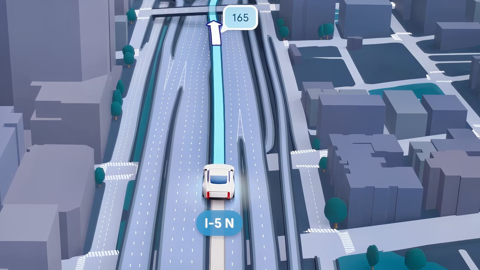
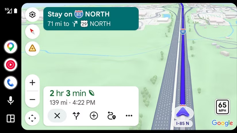
Google’s new immersive 3D navigation UI is finally turning up in cars running Android Auto, and it’s more than a fresh coat of paint. Back in March, the company revealed a substantial overhaul of the Maps navigation system with an interface it framed as immersive. Now, users are reporting the updated view in their vehicles, complete with pronounced 3D landmarks and even individual trees that make the road environment easier to interpret at a glance. This is the kind of visual fidelity that matters when you’re trying to decide which complex junction to take in seconds, not minutes. The rollout appears to be tied to Android Auto v17.3 and driven largely by server-side changes, which explains why some users with the latest version still don’t see it in their cars yet. That staggered arrival can feel frustrating, but it also shows Google is treating in-car UI changes with caution, not pushing them live in a single disruptive wave.
Sonos: From Confusing Controls to a Thoughtful Listening Hub
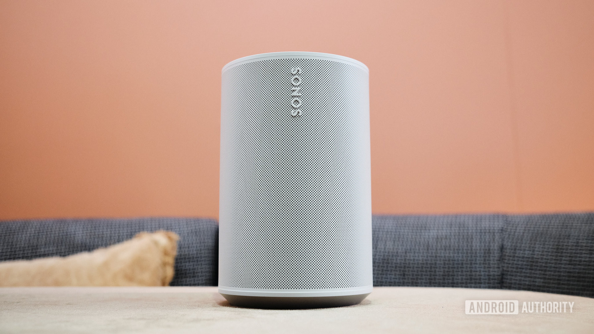
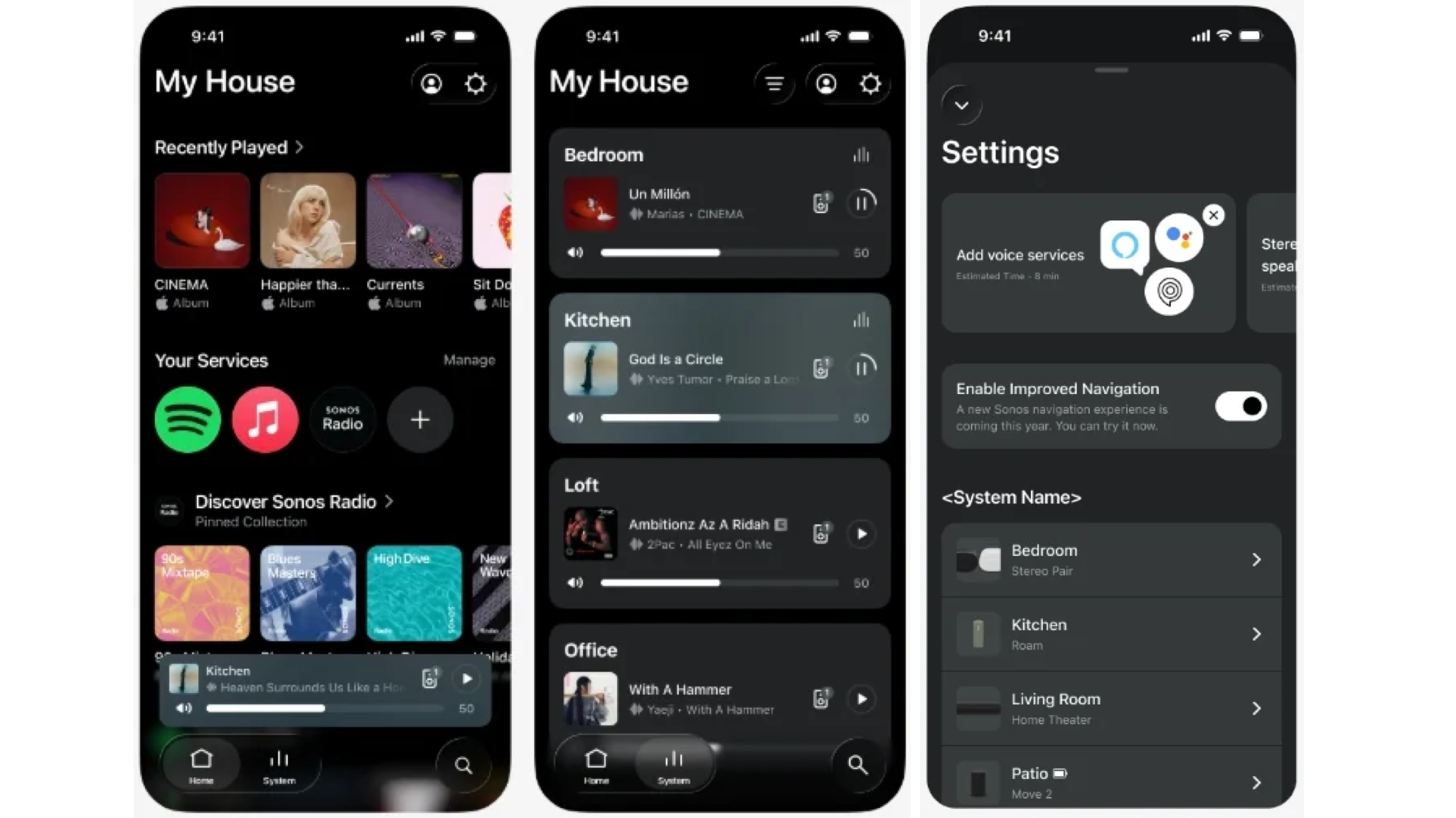
On the home audio side, the new Sonos app update is a direct response to years of user workarounds and complaints. Sonos users may not need to keep creating alternative apps for their systems anymore: the official app is getting a significant update that’s rolling out now. The changes are focused where pain has been highest—navigation, volume controls, and speaker ordering. The app and Player now offer clear tabbed navigation with more prominent Home, System, and Search options, plus buttons that clearly show what’s selected. You can reorder speakers and rooms directly, sorting alphabetically, by frequency of use, or by which speakers are currently playing, and pin favorite speakers for faster access. On iOS, a new Dynamic Volume slider expands when you interact with it and displays the actual volume number inside the slider, turning guesswork into precision. These are not flashy features; they are practical fixes to daily friction—and that’s why they matter.
Different Screens, Same Goal: Usable, Calm Experiences
What ties these moves together is a quiet but important pivot toward app interface improvements, tailored to where the app lives. In the car, Google Maps’ revised 3D design with better landmarks and trees makes the route feel more readable while you’re focused on driving. At home, Sonos’ tabbed navigation and clearer Home, System, and Search buttons push core actions to the foreground instead of hiding them in menus. The new iOS volume slider that grows on touch and shows the exact level is another subtle nudge toward control you can trust instead of “close enough.” According to ShaunFromSonos, users shouldn’t have to wait more than two weeks for the update on iOS or Android, with the timescale “likely sooner,” underscoring the phased rollout approach that favors stability over speed. Together, these changes show a cross-ecosystem trend: less chatter, more clarity, and interfaces designed to stay out of your way.
The Slow Rollout Is Annoying—and Still the Right Call
There’s an obvious downside: you might open Google Maps or the Sonos app today and see nothing new. The Maps immersive UI seems to be mostly a server-side change, which is why some people with Android Auto v17.3 still can’t access it in their vehicles yet. On the audio side, Sonos is running a phased rollout that won’t reach everyone at once but should hit all devices within the next fortnight, with a stated maximum wait of two weeks for iOS and Android. That staggered timing can make users feel left out, especially when screenshots start circulating online. But the alternative—a single, global switch for navigation or playback controls—would be worse if anything breaks. In-car navigation and multi-room audio are systems people rely on daily; they deserve slow, careful updates. The takeaway is clear: expect some delay, but don’t mistake gradual rollouts for hesitation. This is what responsibility looks like in interface redesigns. When the updates arrive, both Google Maps and Sonos will feel less like software you operate and more like tools that quietly fit the way you move and listen.