
A Small Navigation Change With Big Design Implications
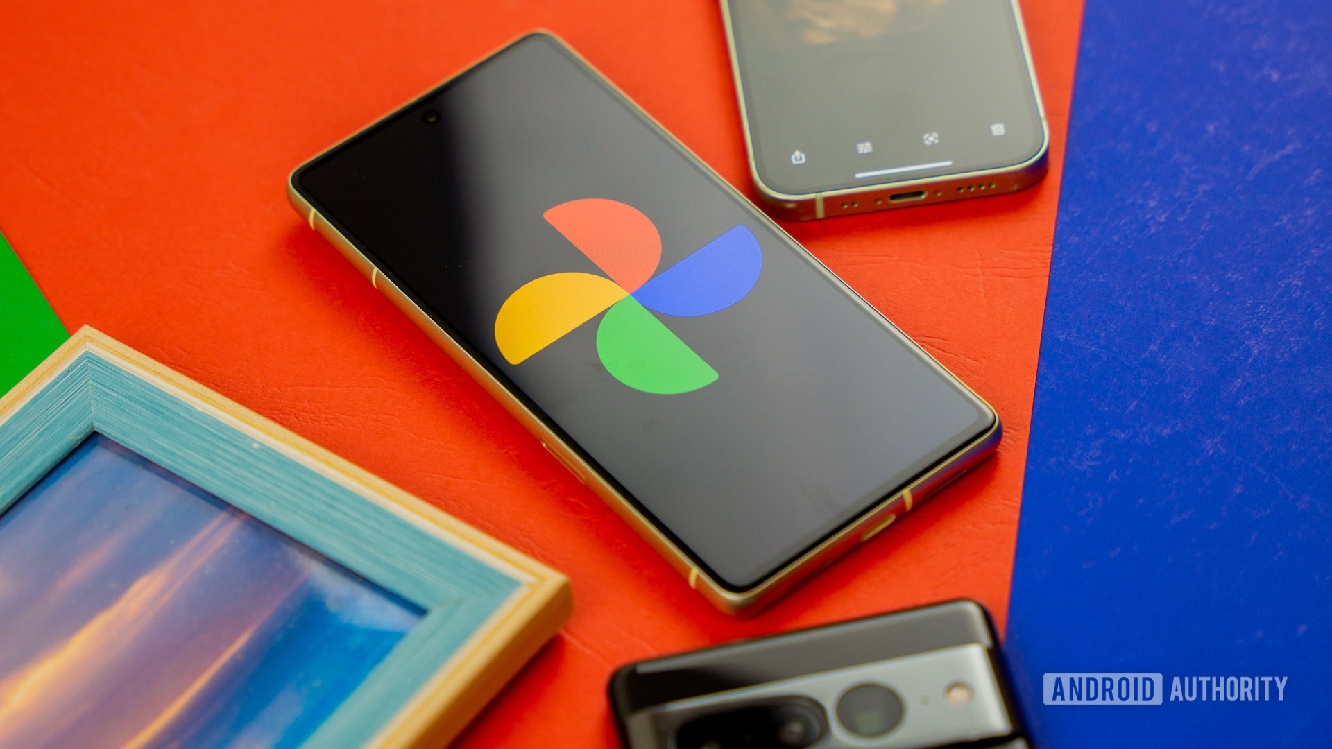
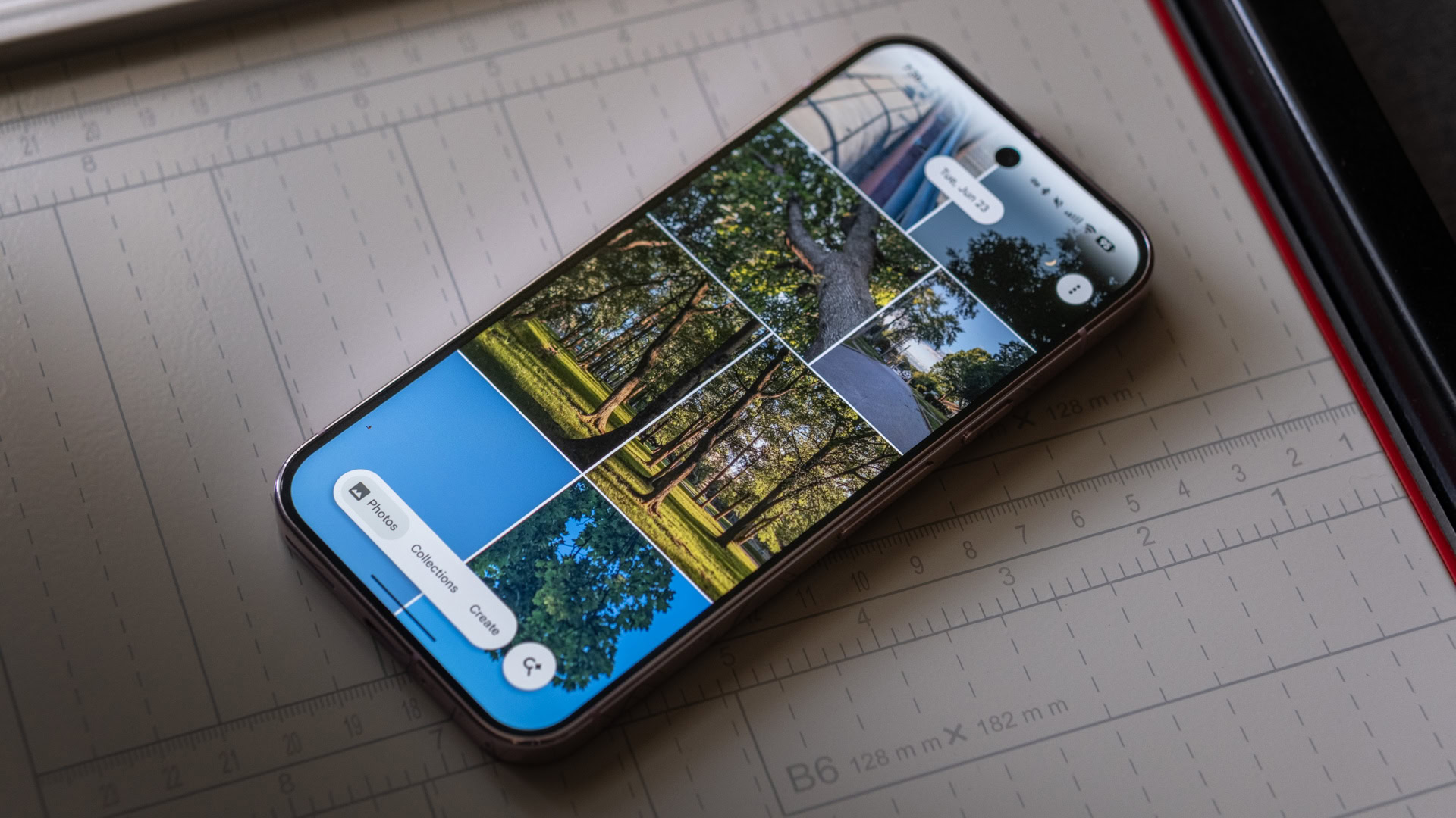
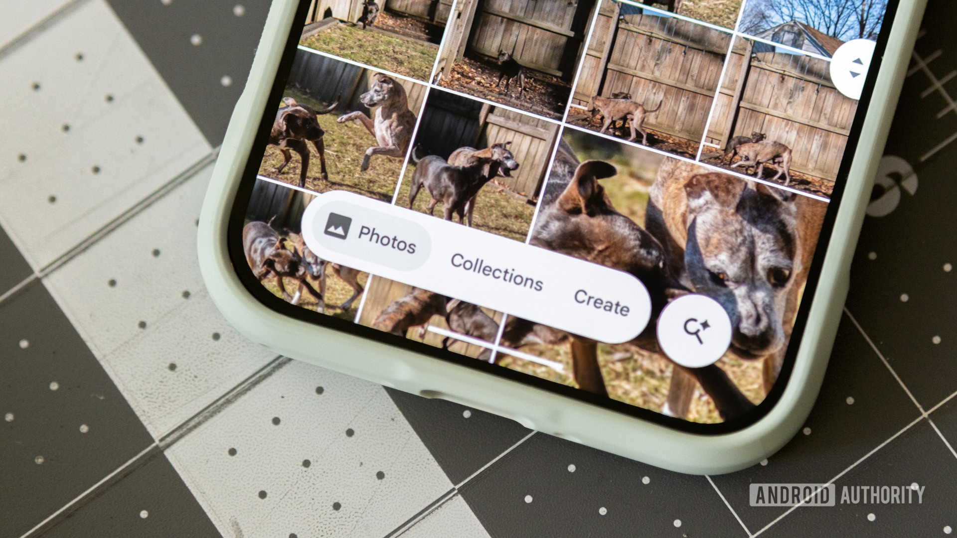
The Google Photos redesign on Android replaces its old ribbon-style navigation bar with a smaller floating pill and a separate circular search button, creating a more modern, fixed layout at the bottom of the screen that saves space, keeps key sections visible, and makes navigation behavior easier to predict for everyday mobile users. This is the kind of quiet app UI change that matters more than it seems at first glance. This week, Google began widely rolling out the navigation bar update, shifting Photos from a wide strip to a pill-shaped control, plus a detached search button that slides in a dedicated search view. Alongside this, an upgraded collage editor with new templates and borders is arriving in version 7.82 of the app, turning what could have been a minor refresh into a notable step in Google’s mobile app design story.
What Actually Changed—and Why It Feels Better
The new Google Photos navigation bar update focuses on usability rather than flash. The floating pill is smaller than the previous ribbon, freeing up more screen real estate and revealing more photos around it. Crucially, it is fixed in place instead of hiding when you scroll, which avoids the odd effect where content moves up while the bar slides down and disappears. Inside the pill, Google has grouped Photos, Collections, and Create into one consistent strip, keeping the top UI stable while the content between them fades in and out as you switch views. The circular search button sits to the right, opening an isolated search pane from the edge of the screen. The result is a cleaner, more predictable navigation experience that feels like it was designed for how people already use their phones, not for a design spec sheet.
User Reaction: A Quiet Win for Intuitive Mobile App Design
Early reaction to the Google Photos redesign has been strikingly positive. In one reader poll with 577 votes, 68% said “Yes, it looks great!” while only 15% said they were not fans and 16% were indifferent. That’s a strong signal that cleaner navigation can win users over even when the change is subtle. Reviewers describe the pill-shaped bar as “less obtrusive and more intuitive,” praising how logical it feels to move between the three main views and into the dedicated search screen. This matters because navigation is the part of mobile app design users feel every time they open an app. When a bar stops jumping around, saves space, and keeps choices obvious, people notice—if only because they stop being annoyed. In this case, the reaction suggests Google has landed on a pattern that could make many of its apps easier to live with day to day.
Beyond Photos: A Template for Google’s App UI Changes
The most interesting thing about this navigation bar update is what it suggests about Google’s broader mobile app design direction. Right now, apps like Gmail, Drive, YouTube, Maps, and the Play Store still use the older ribbon-style nav bars that Photos has moved away from. Yet the pill-shaped model is already appearing in other places: Google’s Files and Wallet apps use similar bars, even if they break the company’s guideline that nav bars should contain three to five destinations. Outside Google, apps such as Oura and Proton Mail have adopted pill-shaped bottom controls, showing this pattern is gaining traction in modern mobile app design. After seeing Photos’ update, some reviewers argue that this layout would improve most Google apps, and it is hard to disagree. A consistent, space-efficient bottom bar across the ecosystem would reduce friction and give Android a clearer visual identity.
Material 3, Collage Updates, and What Comes Next
Formally, Google’s Material 3 Expressive guidance still favors shorter, flexible nav bars tuned for foldables and tablets, not pills floating above the content. That makes the Photos redesign feel slightly ahead of the official playbook—but possibly not for long. Reviewers already speculate that an update to Material 3 Expressive could land as soon as Android 18, potentially making this pill pattern a blessed standard across Google’s apps. In parallel, Google Photos is gaining more powerful creative tools. The new collage editor, now widely rolling out, brings categories like Grid, Film, and Classic, plus a Borders view so users can adjust collage borders to taste. This feature appears in version 7.82 of the Android app. Taken together, these app UI changes point toward a single goal: streamlining how people move through Google’s ecosystem while giving them more meaningful controls over what they create.