
YouTube Music’s Now Playing Redesign, Defined
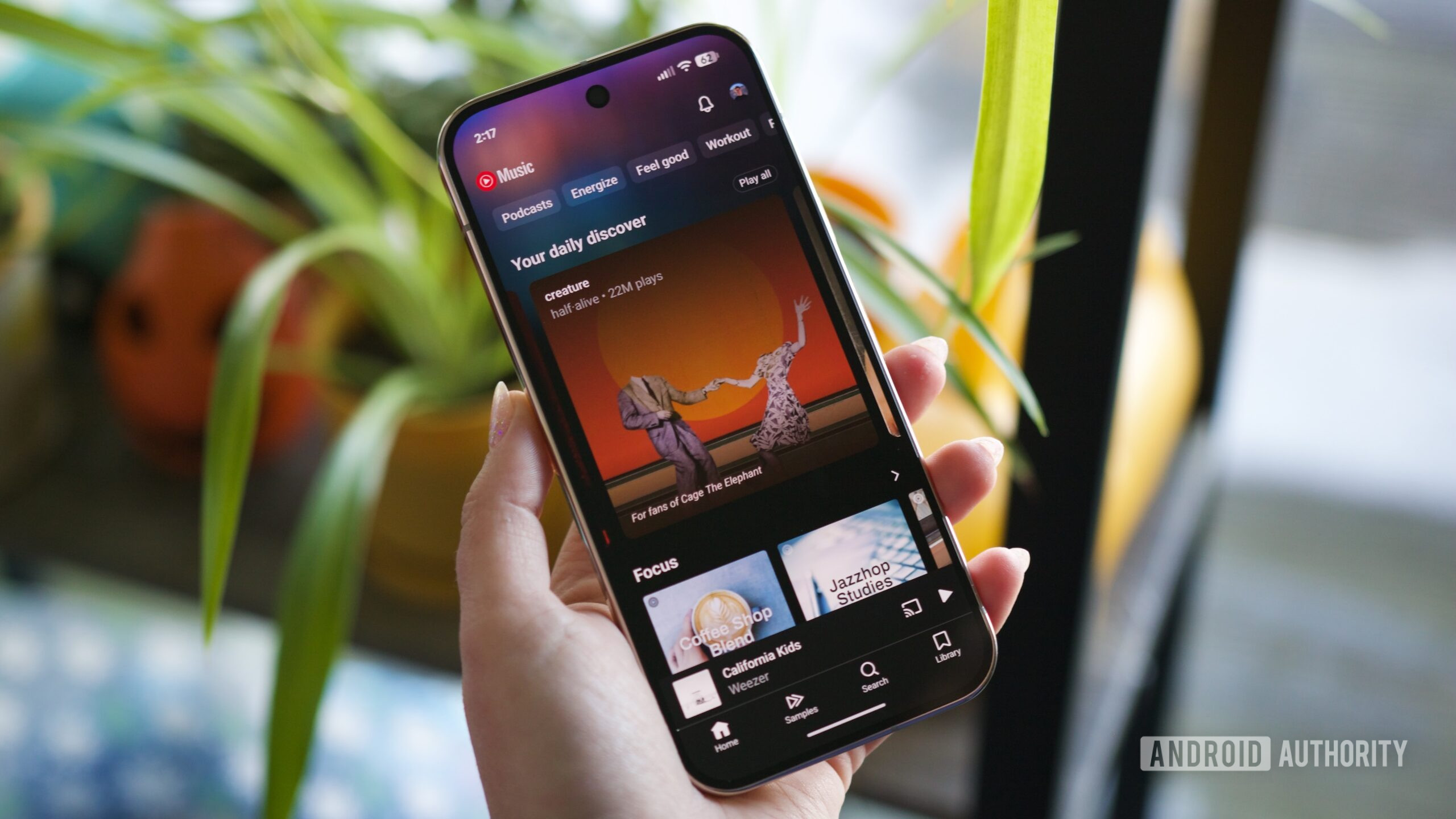
YouTube Music’s Now Playing screen redesign is an experimental interface update that replaces the small album thumbnail with full-screen album art to create a more immersive, visually rich listening experience while keeping the core playback controls intact.
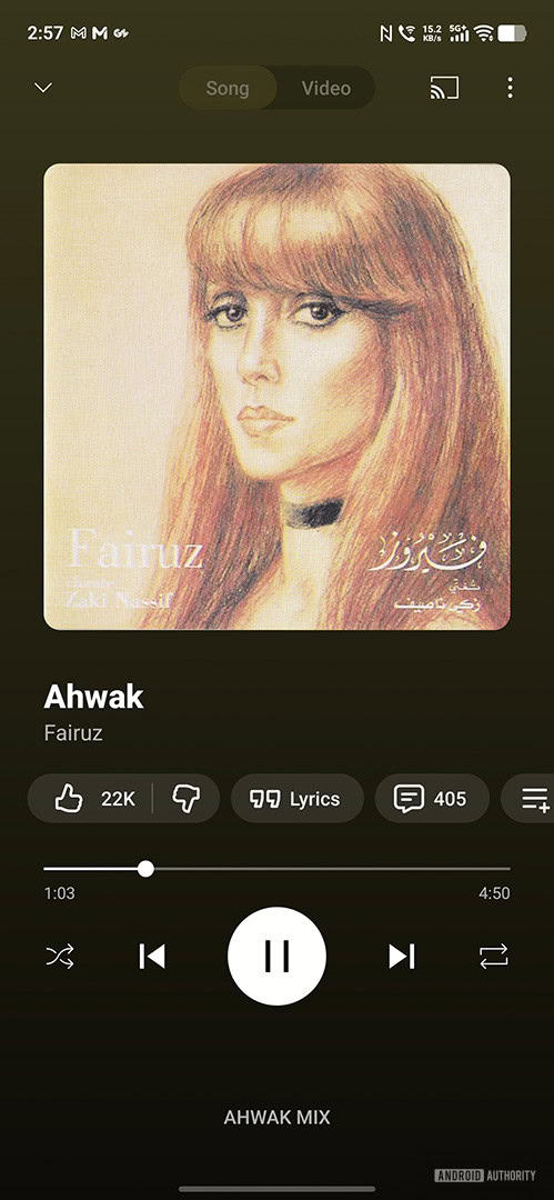
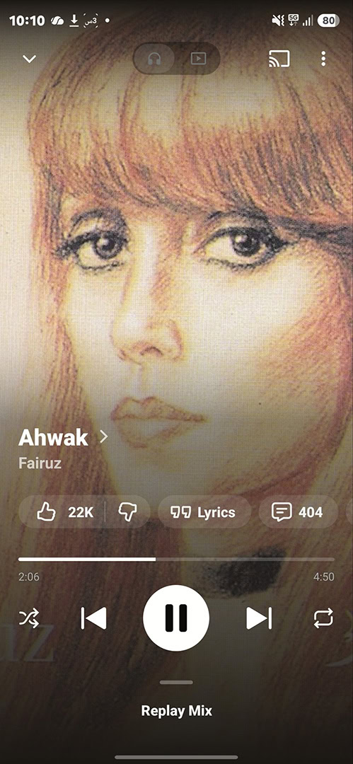
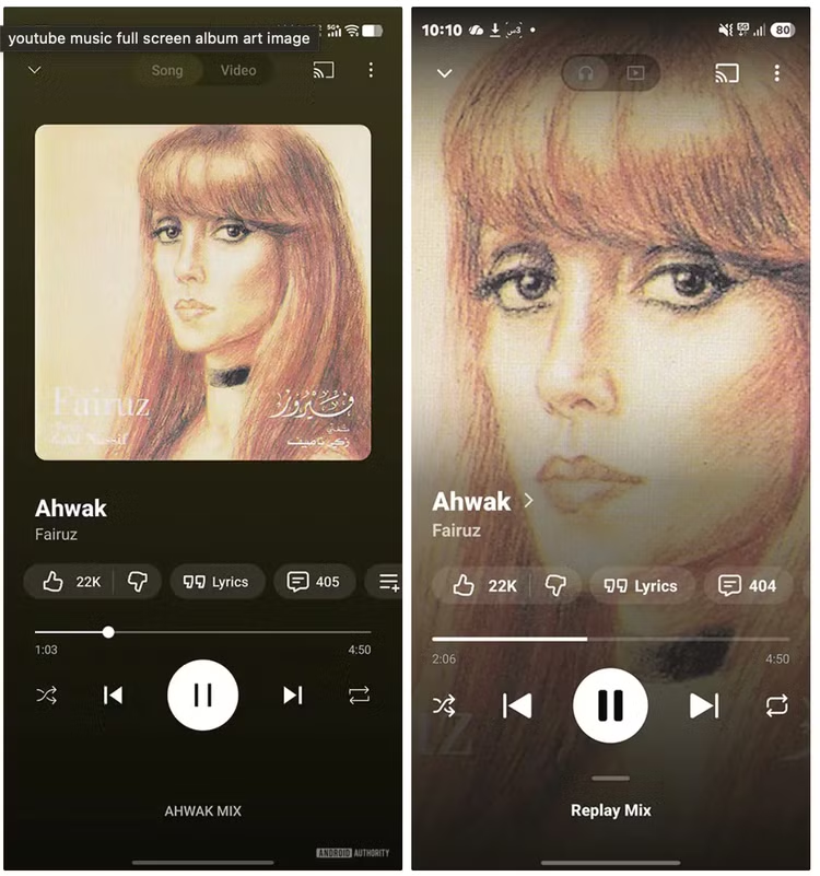
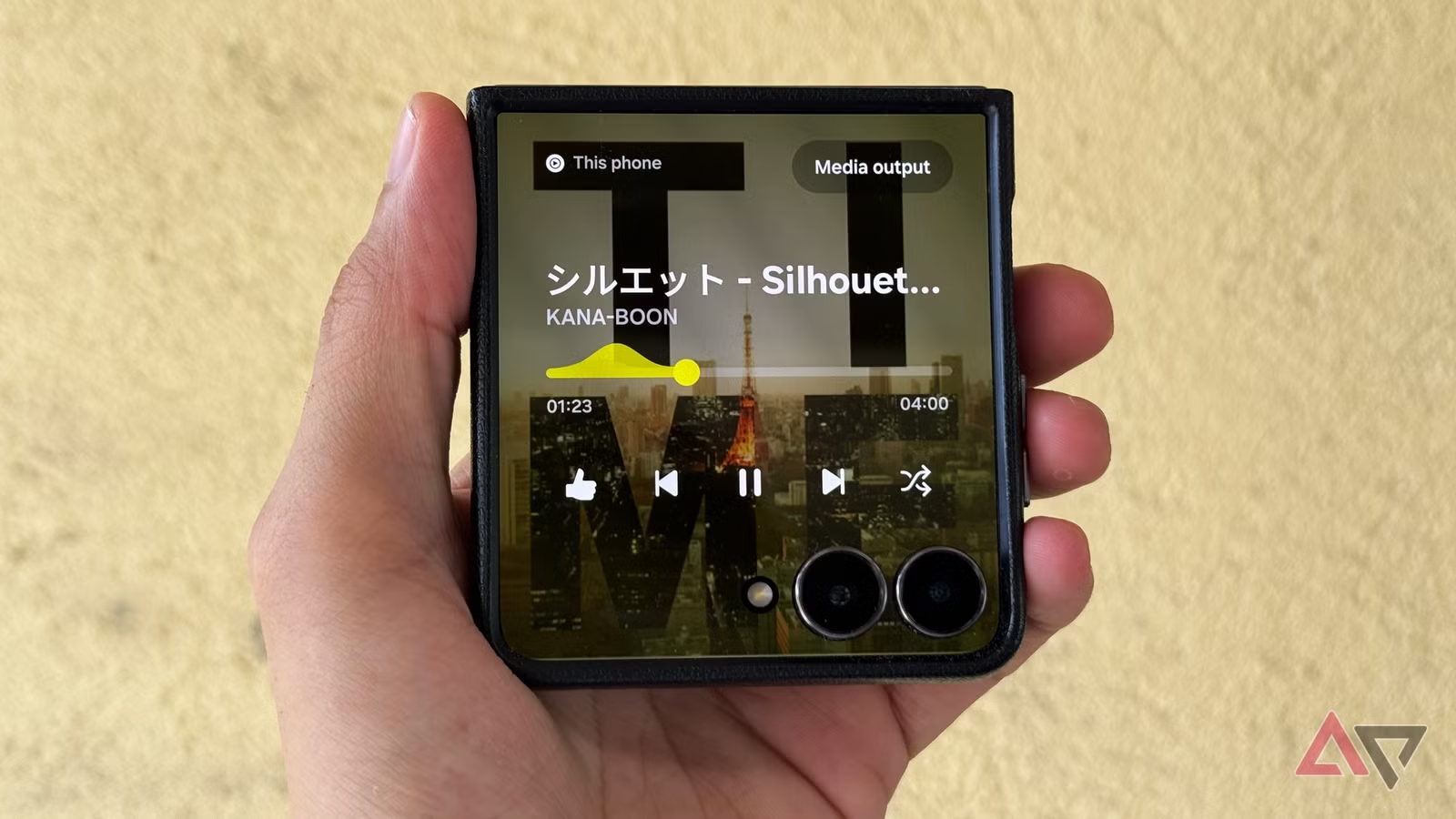
This YouTube Music redesign matters because it finally treats album art as more than a postage stamp. The service is testing full-screen album art on the Now Playing screen, moving from a tiny square to a dominant visual that fills most of the display. According to a screenshot shared by Telegram user Hamada, the new layout is already live for some testers. In other words, this is not a concept; it is in the wild. And it looks like a clear attempt to bring the music app interface in line with rivals that already use bolder, edge-to-edge visuals. If you care about how your music app feels, not just how it sounds, this is the kind of change you notice.
Why Full-Screen Album Art Is More Than Cosmetic
On the surface, the Now Playing screen update is a simple visual upgrade: the album cover grows from a small, old-school square into full-screen album art that dominates the page. But presentation shapes how we experience music apps. The old layout, with its tiny artwork, feels dated compared with services that already offer full-screen or even animated art. Early impressions say the new look “is definitely a big step up from the small thumbnail,” and that it “looks quite good.”
This is about emotional connection as much as aesthetics. Full cover images make playlists feel curated, not generic. They turn the Now Playing view into a digital record sleeve, something you can glance at and instantly associate with a mood, era, or artist. For listeners who use their phone as a bedside player, desk companion, or car display, this is the difference between a functional widget and a screen you actually enjoy leaving on.
Not Everyone Will See It—Or Want It—Yet
Before you start hammering the update button: this is a limited test. Reports confirm that YouTube Music is experimenting with adding full-screen cover art but that reviewers could not reproduce the feature on any of their devices. Google has a long history of running A/B tests and quietly abandoning ideas that do not meet its metrics, and it is “possible that full-screen album art…never goes beyond the limited test it is currently in.”
Even among fans, the reaction will not be unanimous. Some listeners prefer the smaller, CD-style square because they treat album art like a physical cover, not a wallpaper. Others barely look at their screen while music plays and see no reason to care. The ideal solution is obvious: offer a toggle. Let visual-first listeners enjoy the expansive layout while minimalists keep the compact grid. If Google forces a single design on everyone, it turns a welcome YouTube Music redesign into another polarizing UI swing.
A Small Change in a Bigger Modernization Push
This Now Playing screen update does not exist in a vacuum. YouTube Music has been gaining traction by bundling strong recommendations with a flexible library and by adding features competitors lack. At the same time, it has been steadily refreshing its music app interface: recent changes to playlists give users more options for how they are sorted, and the app’s search bar has been updated as part of this broader modernization.
Full-screen album art fits neatly into that arc. It is a relatively low-risk way to make the app feel more current without rewriting core features. It signals that YouTube Music understands that polish matters, especially when rivals like Apple Music already use more expressive visuals on their Now Playing screens. According to one report, “YouTube Music is experimenting with adding full-screen cover art,” tying it directly to a more modern look for the service. If Google follows through, this could mark the point where YouTube Music stops feeling like a YouTube add-on and starts feeling like a fully confident music platform.
What This Means for the Future of Listening on YouTube Music
So what does this all add up to? If full-screen album art ships widely, YouTube Music’s Now Playing screen will feel less like a utilitarian player and more like a canvas for the music itself. That is good news for artists who obsess over cover design and for listeners who enjoy a more immersive vibe when they hit play.
The risk is not the feature; it is stagnation. If Google kills this test, YouTube Music stays a step behind competitors that treat interface design as part of the product, not an afterthought. The opportunity is clear: keep the feature, add a simple toggle for layout preference, and continue refining playlists and search so that the app’s brains and its looks evolve together. Visual upgrades will not fix a bad recommendation engine—but for a service that already “gets the next track right” most of the time, this is the kind of polish that can turn casual users into loyal ones.