
What the Floating Bottom Bar Really Is—and Why It Matters
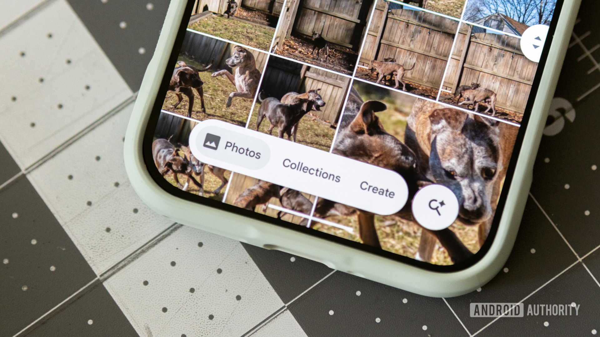
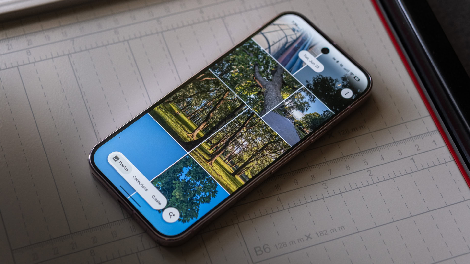
The Google Photos redesign on Android introduces a floating bottom bar, a pill-shaped navigation element that replaces the traditional docked Android navigation bar and is paired with a separate circular search button, changing how users access core sections of the app and subtly modernizing the entire interface.
This UI update 2024 is more than a coat of paint: Google Photos is now widely rolling out a floating bottom bar redesign on Android that changes how you move around the app. Instead of a bar pinned to the very bottom edge, you now see a raised pill hovering slightly above the content, with a round button off to the side for search and “Ask Photos.” A server-side update has pushed this to users on versions 7.82 and 7.83 of Google Photos, with the company advising a force stop if the new layout does not appear immediately. The move is opinionated: Google is clearly betting that this navigation model should be the new normal, not an experimental one-off.
How the New Navigation Changes Everyday Use
Functionally, the floating bottom bar reorganizes the core of the Google Photos redesign around three main destinations—Photos, Collections, and Create—grouped inside the central pill. A detached circular button on the right opens search and the Gemini-powered Ask Photos, sliding in a dedicated view that strips away other UI so you can focus on finding images. This layout keeps the top UI consistent while the content between header and pill fades in and out as you switch tabs, which makes the app feel more coherent and less jittery.
The practical impact is immediate: the pill saves screen real estate by trimming away empty padding, so you can see more photos below and beside the bar. At the same time, the bar stays fixed instead of hiding as you scroll, solving the odd behavior of the old design where content moved up while the nav bar slid down and vanished. This consistency lowers cognitive load; you do not have to wonder where navigation went, and you get slightly more grid space for your images.
A Quiet Break from Material 3—and a Preview of Its Future
Here is the interesting twist: this floating bottom bar does not neatly fit into Google’s own Material Design 3 Expressive rules. The closest existing component in the library is called a floating toolbar, which is not meant to be used as a primary navigation bar. On top of that, the company’s guidelines say bottom bars should hold three to five destinations, yet other Google apps like Files and Wallet already use similar pill-style bars with only two destinations, breaking the rule.
In practice, that means Google Photos is ahead of the spec. Rather than waiting for the design bible to catch up, the product team is shipping what works. One poll of 577 respondents showed that 68% liked the new navigation bar, while only 15% disliked it and 16% were indifferent. That kind of reception is hard to ignore. It also hints at where Material 3 Expressive may be headed next; one source even suggests we could see an updated guideline as early as a future Android 18 release.
What This Signals for Gmail, Drive, and the Rest of Google’s Suite
Today, most of Google’s big apps—Gmail, Drive, Maps, YouTube, the Play Store—are still stuck on the older ribbon-style bottom bars that Photos just left behind. Meanwhile, the floating pill pattern is quietly showing up in other places, such as Chat and Finance, where bottom elements are similarly lifted above the edge of the screen. After seeing how much cleaner and more intuitive Photos feels with the floating bottom bar, it is hard not to imagine the same treatment applied to mail, files, or navigation.
The argument for spreading this design is straightforward. The pill bar is less obtrusive yet always present, gives faster access to core tools like Photos, Collections, Create, and search, and trims visual clutter by reducing unused negative space. It also brings Android navigation bar behavior closer to what users see in non-Google apps that already use floating pills. If Google is serious about a modern, unified UI update 2024 and beyond, this is the pattern that could tie its app suite together.
A Small Navigation Tweak with Long-Term Consequences
The floating bottom bar in Google Photos is not a radical redesign, but it is a decisive statement about where Google wants Android app navigation to go. By saving vertical space, fixing navigation in place, and making search a dedicated, always-ready action, the redesign makes Photos look and feel more modern than many of Google’s own flagship apps.
This change also shows that Google is willing to let product teams move faster than its own design documentation. That is a healthy sign. If Material 3 Expressive evolves to bless what Photos, Files, Wallet, Chat, and Finance are already doing, the floating bottom bar could become the new default pattern for Google’s ecosystem. For users, that would mean more consistent, less cluttered, and more predictable navigation across the apps they live in every day—and that is a future worth rooting for.