

What You’re Building and What You Need First
Excel dynamic timelines and PivotTable summaries are structured ways to turn long, flat spreadsheets into visual stories and quick summaries so you can explore patterns, answer questions, and share insights without writing complex formulas or changing your original data.
Think of this as two skills that work well together: a visual timeline for events over time, and a PivotTable for summarizing thousands of rows into a few meaningful numbers. If you already track projects, events, or sales in Excel and feel swamped by scrolling, this is for you. You will need: a worksheet where each row is one record, dates stored as real dates, and clear column headers. Before doing anything, convert your raw range into an Excel table so it expands automatically when you add data: select any cell, go to Home, choose “Format as Table,” make sure “My table has headers” is checked, then click OK. Skipping that checkbox is one of the most common early mistakes.
Build an Excel Dynamic Timeline in Minutes
A timeline chart in Excel is really a line chart that has been adapted so each date becomes a vertical tick with a label, giving you a clean, dynamic view of events over time. The nice part: once you set it up, the chart updates when you edit the underlying table, so you can keep adjusting your story without rebuilding the visualization every time.
- Format your source as a table: select any cell in your dataset, choose Home > Format as Table, ensure “My table has headers” is checked, then confirm.
- Add a Helper column: in the first empty header cell (for example C1), type Helper and press Enter to create a numeric column for the chart’s y‑axis.
- Fill Helper values: in the first Helper data cell (such as C2), enter =CHOOSE(MOD(ROW()-ROW(Table1[#Headers])-1,6)+1,10,-10,20,-20,30,-30) and press Enter, then fill down to the last row.
- Insert the base chart: select the Date column (with its header), hold Ctrl and select the Helper column, then go to Insert > Line Chart > Line with Markers.
- Turn markers into timeline ticks: select the chart, click the + icon, enable Error Bars, then choose More Options; set Direction to Minus, End Style to No Cap, and Error Amount to Percentage = 100.
- Hide connecting lines and style markers: in Format Data Series, choose No Line, then pick a marker style and color so each event dot is easy to read.
- Tidy the axis: select the horizontal axis and set your minimum and maximum bounds to the desired start and end dates; set tick marks and label position to None so only your custom markers show.
The “gotcha” here is the Helper column: without numeric values on the y‑axis, your line chart can’t space events above and below the timeline, and labels will overlap badly. The provided formula alternates between positive and negative values so each marker sits on a different side of the center line, keeping labels readable. When you are done, “your timeline is complete” and any change you make in the table—adding, removing, or editing dates—automatically flows into the chart. That gives you a practical data visualization Excel can maintain for you instead of a static graphic you need to redraw.
PivotTable Basics: Summaries Without Manual Formulas
A PivotTable is a drag‑and‑drop tool for summarizing data, not a coding exercise. Once you understand the basics, you can turn thousands of rows into clear, meaningful reports in minutes while exploring your data without ever changing the original spreadsheet. That means no huge nests of SUMIFs, fewer copy‑paste errors, and more time thinking about what the numbers mean instead of how to calculate them.
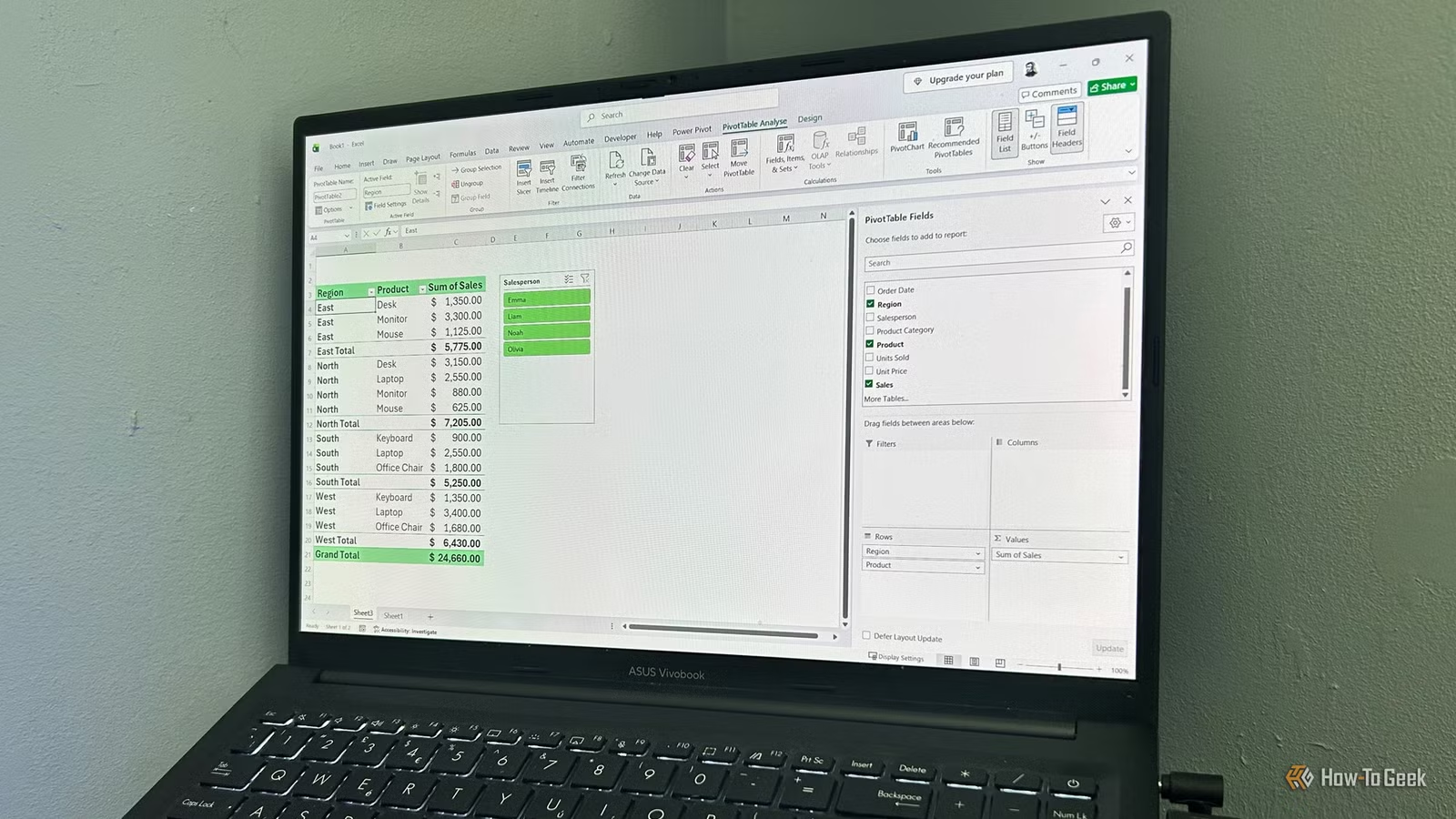
Clean source data is the key. Before creating a PivotTable, make sure every column contains one type of information (for example Date, Product, Region, Sales) and every row is a single record. Check that every column has a unique header, there are no blank rows inside the dataset, and dates and numbers are stored as their proper types, not as text. Convert the range into an Excel table (Ctrl+T or Insert > Table) so new rows are included when you refresh. Then create the PivotTable: select any cell inside the table, go to Insert, click the top half of the PivotTable button, choose whether to place it on a new or existing worksheet (using a new sheet keeps data and analysis separate), and click OK to open a blank layout.
From there, the PivotTable Fields pane does the work. It lists your source columns at the top and four areas below: Rows for categories down the left, Columns for categories across the top, Values for the calculations, and Filters for a report‑level filter menu. You can tick the box beside a field and let Excel place it, or drag fields into the areas yourself. Numeric fields in Values are summed by default, while text fields are counted, and you can drag the same field into Values more than once if you want sum and average side by side. A common mistake here is forgetting to refresh when your source data changes; use the PivotTable Analyze tab’s Refresh button so your summaries stay in sync.
Why This Approach Saves Time and What to Watch For
These techniques are about getting Excel to organize and present information for you so you can spend more time on analysis. A dynamic timeline built from a standard line chart can be created in about ten minutes and stays in sync as you edit your table, giving you a reusable way to show milestones or events over time. PivotTables let you explore the same dataset from many angles—by product, by region, by month—without writing new formulas or changing the original sheet, which is especially helpful when you are working with thousands of rows.
The main pitfalls are small but important: forgetting to tick “My table has headers” when formatting your table, leaving blank rows in the source data, or mixing text and numeric formats in the same column. Any of those can lead to missing values, confusing field names, or dates that refuse to sort correctly. Once you get into the habit of structuring data cleanly and using tables, timelines and PivotTables become reliable tools instead of one‑off tricks. The payoff is clear: you reduce time spent on manual data organization and avoid building extra formulas or reports every time you want a new view of the same data.