


What a PivotTable in Excel Does for You
A PivotTable in Excel is a drag‑and‑drop data aggregation tool that turns thousands of structured rows into clear summaries, totals, and counts without changing your original data, making everyday Excel data analysis faster for people who don’t want to write formulas. PivotTables have a reputation for being intimidating, but at heart they are a friendly reporting layout: you pick which fields go into rows, columns, filters, and values, and Excel does the math for you. If you can select cells and tick checkboxes, you are qualified to use them. The only real prerequisite is clean source data—each column must store one type of information and each row must represent a single record. Once that is in place, PivotTables help you summarize data in Excel with far less effort than building complex formulas.
Get Your Data Ready: The Crucial Setup
Before you touch the PivotTable button, do a quick health check on your source range. Every column needs a clear, unique header, such as Date, Product, Region, or Sales, and every row should represent one complete record. Avoid blank rows in the middle of your dataset, and keep dates formatted as dates and numbers formatted as numbers—mixing text and numbers in the same column is one of the most common mistakes that leads to broken summaries and confusing totals. Next, convert the range into an Excel table, so that new rows are picked up automatically when you refresh the PivotTable. Select any cell in the dataset, go to the Home tab, click "Format as Table," choose a style, ensure "My table has headers" is checked, and click OK. This simple move makes your future reports more reliable and saves you from constantly redefining ranges.
Step‑by‑Step: Build Your First PivotTable
Think of this section as me sitting next to you at your laptop, walking you through your first PivotTable in Excel. The outcome we’re aiming for is a clean summary that updates when your underlying table changes, so every click matters. According to Microsoft 365 documentation, "once you understand the basics, you can turn thousands of rows into clear, meaningful reports in minutes". The ordered list below keeps you from missing a key step or wandering around the ribbon.
- Click any cell inside your Excel table containing the data you want to summarize.
- Go to the Insert tab on the ribbon and click the top half of the PivotTable button.
- In the dialog, choose New Worksheet to place the PivotTable on a separate sheet from your source data, then click OK.
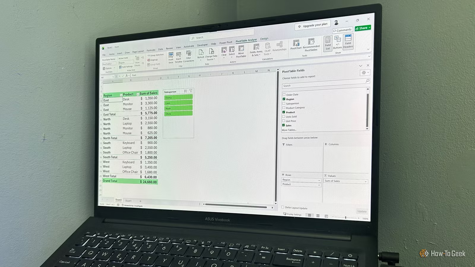
- In the PivotTable Fields pane, drag a category field (such as Product or Region) into the Rows area to list your categories down the left.
- Drag a numeric field (such as Sales or Quantity) into the Values area so Excel can calculate sums or counts.
- Optionally, drag another field into Columns to split your results across the top of the report, or into Filters to add a report‑level filter.
- Experiment: drag fields in and out of Rows, Columns, Values, and Filters until the PivotTable layout tells the story you need.
- When you add, remove, or edit rows in the underlying table later, click inside the PivotTable, open the PivotTable Analyze tab, and use Refresh so the summary reflects the latest data.
As you move fields between areas, the PivotTable updates instantly without altering your original spreadsheet. A common gotcha is forgetting to refresh after changing the source table, which leaves your report out of date even though the underlying data has moved on. Another is dropping a text field into Values and wondering why you’re getting counts instead of sums—Excel counts text but sums numbers by default. If you want different calculations, drag the same numeric field into Values more than once and change each copy’s Value Field Settings to average, max, or min. The more you drag things around, the faster the interface will feel.
Clean Layouts, Dynamic Updates, and a Timeline Parallel
Once your PivotTable is laid out, you can treat it as a flexible Excel data analysis hub. The PivotTable Analyze tab lets you refresh data and add interactive filters so you can explore your dataset from different angles without touching the raw table. These features help you move beyond simple summaries and use PivotTables as a more adaptable tool for presenting your data. There’s an interesting parallel with building a dynamic timeline chart: when you convert raw dates into an Excel table and hook a chart to that table, changing the dates or adding rows makes the chart update automatically. The same idea applies here—by basing your PivotTable on a proper Excel table and refreshing, you keep your summary in sync with thousands of rows while your source sheet stays untouched. It’s a neat way to separate messy input from clean output.
Is Learning PivotTables Worth It?
If you work with large spreadsheets—even a few thousand rows of sales, projects, or events—learning PivotTables is absolutely worth the effort. Once you’re comfortable with the drag‑and‑drop layout, they become your go‑to data aggregation tool for when formulas feel fragile or slow to build. The big things to watch are source‑data quality and refresh discipline: give every column a unique header, avoid blank rows, keep dates and numbers in the right formats, and remember to refresh after edits. Treat your table like the database and your PivotTable like the report on top. When that habit sticks, you can explore your data in minutes, create multiple views without copying sheets, and keep your original data clean. For everyday Excel data analysis, that’s a solid win.