
Mistake 1: Treating What You Saw as What the Camera Saw
The most common photography mistakes in landscapes and beyond come from assuming the camera records scenes the way your eyes and brain experienced them, when in reality your vision stitches together many shifting glimpses into one polished mental picture while the sensor captures a single fixed slice of light in one instant with one frame, one exposure, and one focus distance.
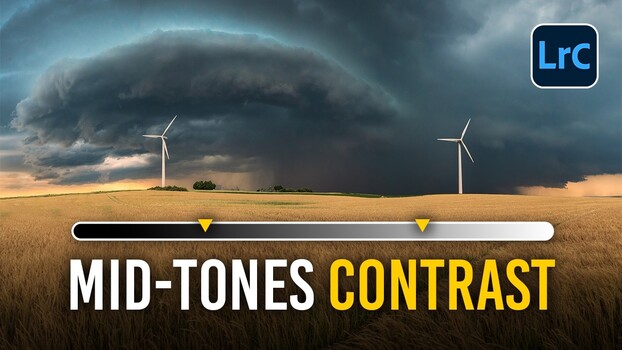
That gap is why your valley at sunset turns into a flat file with blown sky or muddy shadows: the disappointment you feel is the distance between a rich mental composite and an honest physical recording. Dynamic range—the span between the brightest and darkest parts of a scene that can hold detail—forces the camera to choose whether to keep the sky or the land, while your vision adapted locally and kept both. The reflex is to blame your gear or start shopping for a new lens, but usually none of those is the real culprit. The smart fix is technical: shoot raw instead of JPEG so you keep more tonal information and have more room to recover highlights and shadows later, and in very high-contrast scenes bracket multiple exposures or use a graduated neutral-density filter to hold back a bright sky.

Mistake 2: Landscape Composition Errors That Flatten Great Locations
Landscape photography looks like it should be easy: you find a beautiful place, point the camera, and press the shutter, then discover the magic you saw has drained out of the picture because a handful of predictable landscape composition errors are fighting the scene instead of supporting it, even when the location and light are ideal.
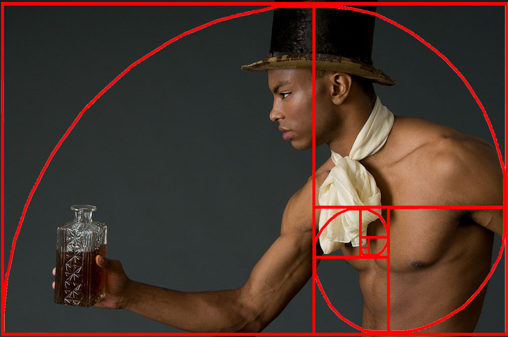
The worst offender is putting the horizon dead center by default, which splits attention between land and sky and leaves the viewer unsure where to look. The fix is deliberate weighting: decide whether the sky or the land is more interesting and give that roughly two thirds of the frame; a dramatic sky earns a low horizon, a strong foreground earns a high one. A centered horizon is not always wrong—reflections, symmetry, and minimalist scenes can gain power from it—but it must be a choice, not a reflex. Skip the mistake of shooting without a foreground and letting the image begin at the midground; instead, move closer to a rock, flowers, or a leading shoreline to create depth and scale. And stop shooting everything at harsh midday; even a strong location looks flat in directionless light, so plan around sunrise, sunset, blue hour, or interesting weather when the light shapes the scene.
Mistake 3: Misplaced Focus and the Myth of “Good Enough” Sharpness
If your landscapes feel soft where it matters, the problem is rarely that you need to fix blurry photos with aggressive sharpening; it is that you placed focus where the camera found contrast instead of where the image needs clarity most, wasting the depth of field you paid for by stopping down.
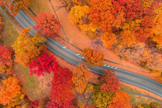
Beginners instinctively focus on the horizon or far mountain, which often leaves the foreground—the very element that gives depth—going soft, or they let autofocus grab the nearest high-contrast edge. The fix is to focus deliberately: use hyperfocal focusing as your default for single-frame landscapes, because it is the most reliable method for maximizing apparent front‑to‑back sharpness at a given aperture and is more accurate than the vague rule of "focus a third of the way in," which often fails with wide lenses or close foregrounds. Then confirm in live view at high magnification that both the nearest important foreground and the distant background are sharp enough for your intended output. Hyperfocal discipline turns guesswork into a repeatable process and keeps your best compositions from being quietly undermined by softness where the viewer’s eye lands first.
Mistake 4: Ignoring Color Profiles and Believing Your Screen
Another silent killer of strong images is blind trust in an uncalibrated screen, whose color profile can hide shadow detail and tonal gradation, making you edit toward a misleading target and ship files that fall apart in print even though they looked fine at home.
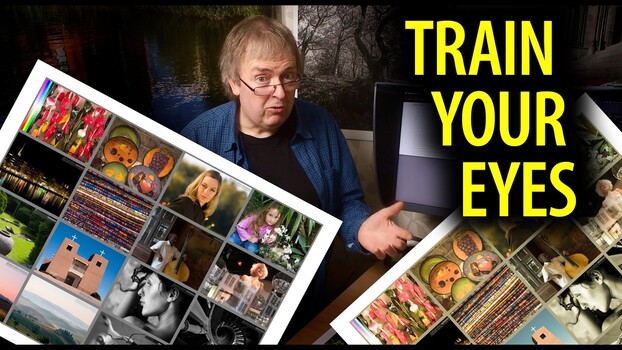
According to Keith Cooper, printing the same image twice with two different profiles and comparing them under controlled lighting is one of the most effective ways to sharpen your eye for print quality. In practice, this print-comparison method is a low-tech form of color profile calibration: use a demanding test image with saturated colors, deep shadows, skin tones, and smooth gradients, then make two prints on the same printer and paper with different media settings. Side-by-side, differences in shadow detail, color gradation, and tonal richness become easy to spot; move the prints several feet apart or into separate rooms and you discover that overall impression can diverge from pure technical quality. That exercise trains you to see what your screen hides and to adjust your editing for the output that matters most—usually print—rather than for a single, possibly inaccurate monitor.
Mistake 5: Portfolio Image Selection That Confuses Instead of Convincing
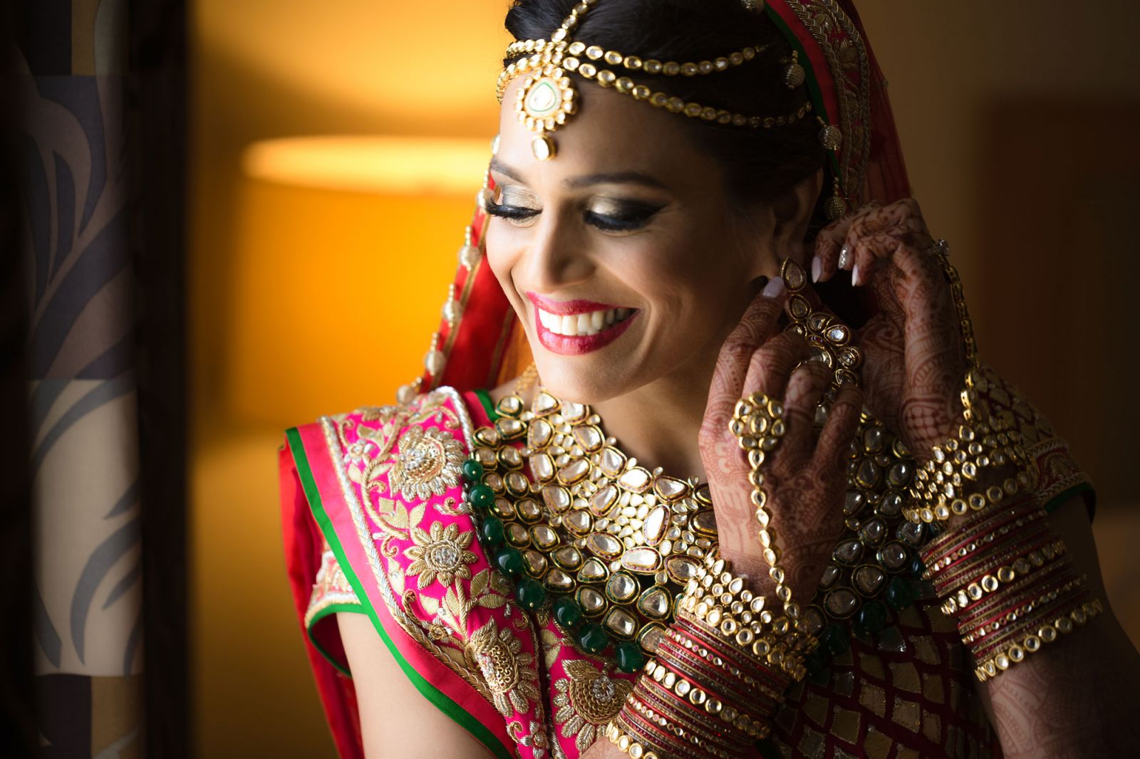
Your portfolio is not a scrapbook of favorites; it is a sales tool whose only job is to answer one question for a potential client: can this person deliver the specific thing I need, done well? Portfolio credibility suffers when inconsistent editing, weak image selection, and mixed genres muddle that answer and make you look like a generalist instead of a specialist.
Including too many images is the most common portfolio mistake, and one weak photo among twenty does more harm than leaving it out. The fix is ruthless portfolio image selection: cut hard to roughly 15 to 30 of your absolute best images and remember that your portfolio is only as strong as its weakest photo. If you are not sure an image belongs, it does not belong; you can always add it back when stronger work gives it context. Avoid the urge to show a little of everything—weddings, landscapes, products, and pets in one gallery—because a mixed‑genre portfolio signals “generalist,” which is read as a weakness in the current market. Instead, specialize in how you present: separate galleries by genre, keep editing consistent within each, and build a diagnostic checklist that forces you to reject borderline images early rather than let them dilute your best work.