
What a Dynamic Excel Timeline Is and When to Use It
A dynamic Excel timeline is a visual line chart built from a simple table of dates and helper values that updates automatically whenever you add, remove, or change data in the underlying worksheet, making it a fast way for project teams to turn raw schedules into an at‑a‑glance view of milestones and progress without complex formulas or specialist software.
If you manage projects in spreadsheets, you know they can turn into cluttered task lists with start and end dates buried in rows. A dynamic timeline turns that same information into a clear sequence of points along a horizontal axis, so stakeholders can see what happens when. Instead of classic Gantt bars, you get a compact view that still supports project visualization in Excel while staying easy to edit. The only real prerequisite is clean date data: “The dates in column A are formatted in a recognized date format and ordered chronologically.” If your dates are messy or mixed with text, fix that first, or the timeline will be confusing and hard to trust.

Prepare Your Project Data as a Table
Before you think about charts, treat your project milestones as data that a chart can read. You can’t build a timeline chart without data, and that data needs to be laid out in a consistent structure: one column for dates, one for milestone names, and space for a helper column that drives the y‑axis. Think of each row as one event—kickoff, design sign‑off, launch—happening on a specific date.
A key move is converting this range into an Excel table. “First, convert your raw data into an Excel table. To do this, select any cell in the dataset, and in the Home tab, click ‘Format as Table’ and choose a style. When the dialog box appears, make sure ‘My table has headers’ is checked, and click ‘OK.’” The table makes later steps dynamic: when you add rows for new milestones, the chart can expand automatically. The main gotcha here is forgetting headers or mixing date formats, which will break the link between the table and the chart and produce gaps or errors instead of a smooth project visualization in Excel.
- Enter your project dates in one column and milestone names in the next, sorted chronologically.
- Select any cell in this range, go to Home > Format as Table, and choose a style.
- Confirm the selection, check “My table has headers,” and click OK to create the table.
- Add a new header called Helper in the next empty column to prepare for chart values.
- Check that all date cells use a recognized date format and that there are no blank rows.
Use a Helper Column to Space Timeline Points
Line charts need numbers on the y‑axis, but your project timeline is about dates and labels. That’s where a helper column comes in: it feeds the chart a repeating pattern of positive and negative values so your markers appear above and below a central line, keeping labels from piling on top of each other. You add these values once; the table takes care of extending them as the project grows.
Once you’ve typed “Helper” in the header cell, “In the first cell of the Helper column (cell C2), type or copy the following formula and press Enter: =CHOOSE(MOD(ROW()-ROW(Table1[#Headers])-1,6)+1,10,-10,20,-20,30,-30).” This formula uses ROW and MOD to create the repeating sequence 10, -10, 20, -20, 30, -30, which “ensure your data points are clearly spaced above and below the central timeline line, preventing the text labels…from overlapping.” The only thing to watch for is the table name: if you renamed it, you must update Table1 in the formula. If you forget, Excel throws an error and your dynamic array of helper values will not fill down correctly.
Turn the Table into a Dynamic Line Timeline
With dates and helper values ready, you can create the chart that becomes your timeline. Excel doesn’t offer a dedicated timeline chart type, but “in Microsoft Excel, you can convert your data into many types of charts. However, frustratingly, there's no option for a standard timeline chart. To get over this hurdle, I use a basic line chart to create a dynamic, professional timeline in 10 minutes.” The key is selecting the right columns and chart style.
To build it, “Select the Date column (including the header), hold Ctrl, and select the Helper column (again, including the header). Then, in the Insert tab, click the ‘Line Chart’ option, and select ‘Line with Markers.’” This combination gives you markers positioned by date on the x‑axis and helper values on the y‑axis. You then customize the line—often by removing the connecting line, formatting markers, and adding vertical lines down to the x‑axis—to create the familiar timeline look: “This step extends a vertical line from each marker to the x-axis, forming the vertical ticks of your timeline.” When you’re done, “You should have a timeline that looks something like this,” and “your timeline is complete.” Because it’s a native chart linked to the table, “if you add, remove, or change the dates in the original table, the chart will update to reflect those amendments.”
Make It Useful for Stakeholders and Everyday Planning
Once the chart exists, the fun part is shaping it into something stakeholders can read in seconds. Line charts in Excel are highly customizable, which means you can highlight key milestones, change colors, and adjust labels until your timeline communicates the story of the project. “One of the benefits of all the standard charts in Excel is that they're highly customizable, meaning you can visualize your data in pretty much any way you want.” You can combine this with conditional formatting in the source table to flag overdue dates or critical milestones that deserve more attention in the chart.
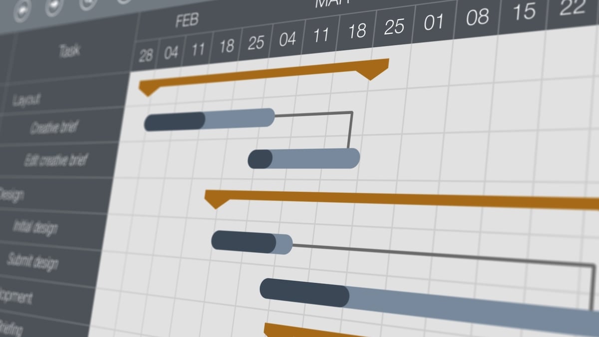
Compared with heavyweight Gantt tools that use color‑coded bars to show status and schedule across many projects, an Excel timeline is lightweight but surprisingly effective for milestone tracking and quick reviews. It’s especially useful when you want a Gantt alternative spreadsheet view for a single project or a small set of milestones without paying for portfolio features like schedule reporting, workload management, or dashboards that specialized software offers. The takeaway: this approach is worth it if your work already lives in Excel and you need a clear picture of “what happens when.” Watch out for messy source data and chart clutter—keep the table clean and the labels short, and your dynamic timeline will stay readable as the project evolves.