

Why Split-Tone White Balance Beats Global Color
Split-tone white balance is the practice of treating different parts of a photo as separate color zones, then grading each zone individually with masking, tone curves, and subtle saturation instead of pushing a single global temperature slider across the entire frame. This produces layered, dimensional color in skies, water, and highlights that feels true to the light you photographed while avoiding the flat, overprocessed look caused by one-size-fits-all edits. Vibrant color that feels alive does not come from louder saturation; it comes from respecting how light changes across a scene and editing those changes intentionally. If you’re still leaning on a single white balance slider to turn a cool frame into a “sunset,” you’re throwing away most of the nuance your sensor captured. A global warm shift might make the scene read as golden hour, but it also erases separation between cool water, warm sky, and neutral highlights by smearing the same cast across everything. The result is the kind of color that looks edited, not experienced.

Get the File Ready: RAW Capture and a Sensible Base Edit
Masked split-toning only pays off if your file has enough color information to work with, which is why shooting in RAW is non-negotiable. JPEG processing bakes in your camera’s color interpretation and discards data, while RAW preserves the full color range your sensor captured and holds cleaner, noise-free color at higher ISOs for evening light. Start by setting a custom white balance in-camera; auto white balance tends to neutralize the warmth that makes late light so distinctive, so bias it slightly warm with a preset like “Cloudy” to protect that character before you even open your editor. Once the file is open, build a restrained global foundation: nudge exposure and contrast, drop black levels a bit, and lift clarity, texture, and vibrance with a light hand. This is scaffolding, not the final look. According to Park Cameras, Gareth Evans uses this sort of base before touching masks so that later color grading masking happens on a balanced, flexible file.
Mask the Water, Sky, and Highlights as Separate Color Zones
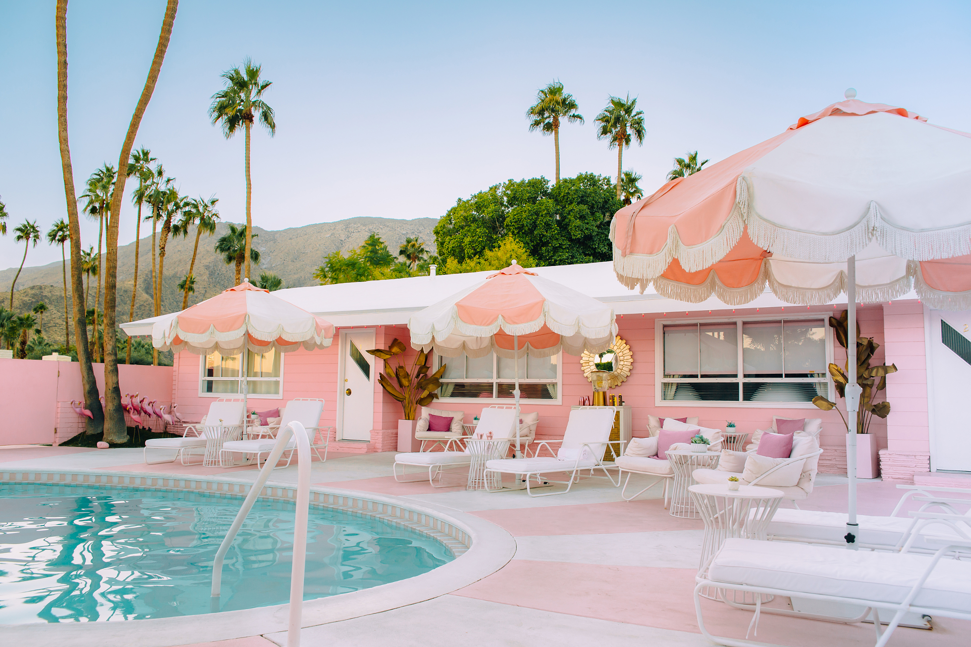
Dimensional color photography starts when you stop treating the frame as a single object and begin treating it as three or more light zones. For a coastal sunset, think in layers: cool water at the bottom, warm band of sunset glow through the middle, and cooler upper sky on top. Create a linear gradient across the sea and cool it deliberately—push more blue into the water, then use tone curve editing on the blue and red channels to tip shadows toward teal and add a touch of red into the highlights. This keeps the water cold and deep so it can contrast with the sky later. Next, add a radial gradient over the central sky where the sun’s warmth lives. Here, go the opposite direction: introduce magenta, a bit of saturation, and curve adjustments that drop blue highlights toward yellow while driving the red channel further into rich reds. Finally, mask the upper sky with another gradient, reintroducing a cooler blue and a hint of dehaze for structure. You’ve now built three distinct color layers instead of one warmed-over wash.
Tone Curves and Subtle Masking: The Antidote to Flat, Overedited Color
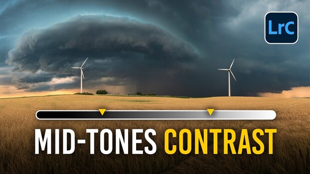
The difference between believable split-toning and cartoonish color is restraint. The most common overediting mistake is grabbing a global saturation slider and dragging it to the right, which leads to muddy skin, neon foliage, and a plasticky look that screams “heavily edited.” Global white balance shifts do something similar to landscapes: they flatten the frame and ignore the distinct colors already sitting in different parts of the image. Mask-based color grading lets you escape that trap. Lift luminance before saturation so colors feel brighter rather than more chemically intense. Use a subtle S-curve on individual channels—a gentle blue-channel curve deepens a summer sky more convincingly than blunt saturation. Inside each mask, make small, targeted moves and toggle them on and off to see the cumulative effect, because stacked minor adjustments add up to the split-tone richness you want. This approach respects natural color accuracy while keeping the final image vivid but believable: vibrant means alive, not loud.
Apply the Method in Any Editor and Know When to Stop
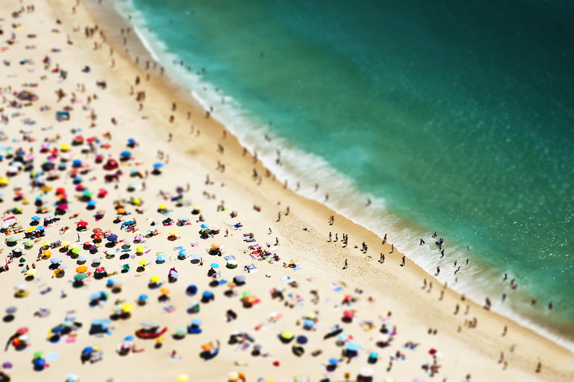
This workflow is not tied to one piece of software. Linear and radial gradients exist in most modern editors, and the idea is always the same: isolate two or three areas that carry different light, treat each as its own edit, and build a split-tone effect with separate cool water, warm sky, and cooler highlights instead of a single global color cast. The underlying principle of color grading masking is portable—selective tone curve editing within those masks gives control that a temperature slider cannot touch. When done well, the expected result is dimensional color photography: blue water at the bottom, glowing sunset through the middle, and a cooler upper sky, all reading as one coherent scene rather than a preset slapped on top. After you finish, step away and look again; what felt punchy during editing often reads as overdone with fresh eyes, and dialing back 10–15% can turn a heavy-handed grade into something that feels true to the light you stood in.