

The Hidden Gap Between Screen and Print
Screen to print color is the mismatch between how a photograph appears on a backlit monitor and how the same image looks as a physical print, caused by differences in light, dynamic range, and viewing conditions that can hide or reveal shadow detail, tonal richness, and subtle color shifts in ways most photographers misjudge until they waste paper and ink. When you stand in front of a scene, your brain builds a seamless impression from many small glances and local adjustments, giving you a memory that feels far richer than any single camera exposure can record. Then you judge the file on a glowing display and assume it is neutral truth. It is not. Unless you train for monitor color accuracy and print preparation photography, your screen encourages lazy editing decisions that fall apart the moment you hit the print button.
Why the Scene, the File, and the Print Never Match
Photographers love to blame gear when a breathtaking valley or skyline turns into a flat, disappointing file, but the real culprit is perception. Your eyes adapt as you scan from bright sky to deep shadow, and your brain stitches those local adjustments into a single mental image where everything seems perfectly exposed. A camera frame has to pick one exposure for the whole scene, so either highlights blow out or shadows sink into murk. Then the monitor steps in with its own bias: it is backlit, contrasty, and adept at hiding weak shadow gradation and noisy dark tones. On screen, muddy areas look "acceptable"; in print, they reveal their lack of tonal richness and detail. If you edit only for what looks good on your display, you are editing for an illusion, not for ink on paper.
Keith Cooper’s Side-by-Side Method: Printing to Train Your Eye
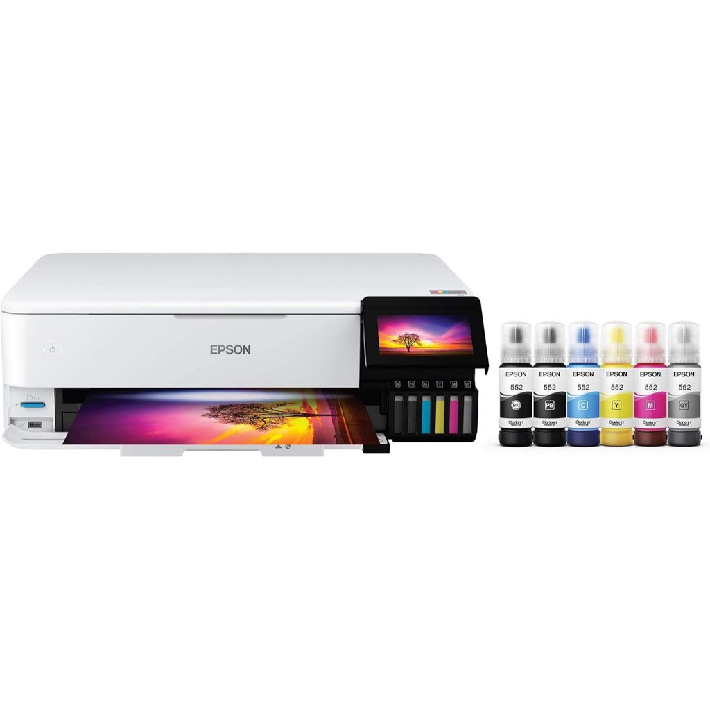
The most effective way to correct your perception is not another calibration gadget, but deliberate color profile comparison. Printing the same image twice with two different profiles and then comparing them under controlled lighting is one of the most effective ways to sharpen your eye for print quality. Keith Cooper demonstrates this with a demanding test image full of saturated colors, skin tones, shadow areas, and sunset gradations, printed twice on the same Epson ET-8550 with two different media settings and profiles. The profiles he compares are the VFA media setting and the Epson matte media setting, both applied to a double-sided matte paper from MediaRange. When the two prints sit side by side, differences in shadow detail, color gradation, and tonal richness are relatively easy to spot. This is not about finding a winner; it is about teaching yourself to notice problems your monitor quietly hides.

How to Run the Comparison—and Why Repetition Matters
Cooper’s exercise is methodical for a reason: it forces you to slow down and look with intent, not emotion. He recommends printing the test image at A3 or larger so critical details are easy to examine, then viewing both prints under a consistent light source, using a hand lens if needed. A dedicated lamp with variable color temperature, such as an Ilfolux model, and a low-cost light meter like the S8608 around $15 (approx. ₱840) help you keep those conditions repeatable. According to Cooper, “most viewers don't see the fine technical details at all, and learning to see them yourself is a skill you have to build deliberately through repetition and structured comparison”. He even suggests returning to the same pair of prints the next day to see whether your judgment changes, then repeating the whole process across different papers and profiles to deepen your visual memory.
From Comparison to Discipline: Editing for the Print, Not the Screen
The surprising insight from Cooper’s method is how much context alters your judgment. When two prints are side by side, spotting subtle flaws in shadow detail, gradation, and color is straightforward; move them six feet apart and it becomes harder, and once they are in separate rooms, you realize that a print’s overall impression can diverge sharply from its technical quality. That gap is exactly what editing only on a monitor exploits: you fall in love with impression and ignore flaws. The fix is workflow discipline. Use structured screen to print color checks as a routine, keep notes on which tones or hues fail in print, and edit with those failures in mind. Over time, that repetition builds a reliable internal reference so you can judge monitor color accuracy against how ink behaves, cut down on waste, and make deliberate, print-ready choices instead of chasing what looks flattering on a glowing panel.