

Why White Balance Matters More Than You Think
White balance in photography is the process of adjusting your camera so that whites appear neutral, which controls how warm or cool every other color looks and determines whether your photo feels accurate to the scene or tinted by the color of the light.
If you’ve ever brought home photos that looked orange in a living room or icy blue at sunset, you’ve met white balance problems. White balance and color temperature control are what make natural color in photography feel truthful instead of artificial. After the exposure triangle of shutter speed, aperture, and ISO, many photographers treat white balance as the “fourth” critical setting, because it defines a neutral point from which all colors are interpreted. Get this right in-camera and you rely far less on lighting color correction later. Your goal here is not perfect technical neutrality every time, but deliberate choices: sometimes accurate, sometimes warmer or cooler for mood, but never accidental.
There is one practical prerequisite: shoot in RAW whenever you can. JPEG bakes in your camera’s color interpretation and throws away data, while RAW keeps the full color range so small corrections don’t break the file or add noise. And remember, RAW is a safety net, not a magic eraser; if the light is mixed and messy, mastering white balance photography in the moment is still faster and better than trying to fix everything later.

An Eight-Step Framework to Dial In White Balance In‑Camera
Think of white balance like tuning a guitar before you play. Here’s a straightforward eight-step routine you can run through every time you move into new light. It keeps your camera white balance settings intentional and consistent, so you’re not guessing and hoping that auto modes will sort things out.
- Look at the light source first. Is it direct sun, shade, tungsten bulbs, fluorescent tubes, LED panels, or a mix?
- Set your camera to RAW + your usual picture profile, so you keep maximum color data while still having a usable preview.
- Open the white balance menu and find the presets: Auto, Daylight, Cloudy, Shade, Tungsten, Fluorescent, Flash, and Custom.
- Match a preset to the scene (sun for midday, shade for backyards, tungsten for household bulbs, fluorescent for office lights).
- Take a test shot and evaluate: are neutral areas (white shirts, gray pavement, skin) looking too orange or too blue?
- If it’s off, switch to Kelvin (K) and nudge the value: lower K to cool the image, higher K to warm it up.
- If the light is stable (studio, venue, recurring location), save that Kelvin or preset as a custom setting for next time.
- As you move or the light changes (sunset to blue hour, window to interior), repeat steps 1–7 instead of trusting one setting all day.
The gotcha here is relying on Auto White Balance because it looks convenient. Cameras are smart, and AWB does a decent job under daylight, but it often struggles at night or under artificial light. You end up with a string of photos where the color shifts slightly from frame to frame, which is a headache to grade and makes consistent natural color in photography harder to keep. Another common mistake is skipping any in‑camera work because “I can fix it later in RAW.” The more drastic the correction, the longer your workflow and the more your files get pushed around in post.
Understanding Color Temperature and Mood
To control color, you need to understand what your camera is measuring. The K number in your camera white balance settings stands for Kelvin, the unit we use for the temperature—or color—of light. Lower Kelvin values represent warmer, more orange light; higher values represent cooler, more blue light. Your camera uses this scale to decide how to shift the colors it records so that a white object appears neutral. When you set a white balance close to the actual light temperature, you get accurate color that matches what your eye expects.
Here’s where mood comes in. If you scroll the Kelvin setting all the way down to around 2500K and take a test image, it will look very blue; if you scroll to 10,000K, the image will turn strongly orange. That simple relationship—down for cooler, up for warmer—is the backbone of color temperature control. It also explains why people talk about preferring “warmer” or “cooler” photos: they are placing white balance slightly above or below the neutral point on purpose. Used carefully, this gives you creative control without sacrificing believable skin tones or natural color in photography overall.
Remember: there is such a thing as accurate white balance, where colors correctly represent what the human eye thinks it is seeing, but there is also room for style. Warm sunlit portraits, for example, are a classic case where you might lean warmer than neutral on purpose to keep the scene feeling alive and inviting.
Practical White Balance Recipes for Common Lighting
Let’s put this into day‑to‑day use. The aim is not memorizing perfect numbers, but knowing where to start and how to tweak. In each case, you begin with the closest preset, then refine with Kelvin if needed. This way your lighting color correction happens in-camera instead of relying on heavy global fixes later.
Daylight: Under clear midday sun, AWB usually does fine, but the Daylight preset keeps things consistent across frames. If the light feels a bit harsh or cold, try Cloudy to add subtle warmth and emulate late-afternoon color. Shade or overcast: Shade and Cloudy presets both warm up naturally cool light so skin doesn’t go gray-blue. Indoors with tungsten bulbs: Choose the Tungsten preset; these household bulbs are very warm, and this setting cools down the orange cast. Fluorescent rooms: Fluorescent preset adds warmth and counters the green tint common with office tubes, though modern fixtures vary, so refine with Kelvin.
Mixed lighting—like flash in a tungsten room or window light in a fluorescent office—is where white balance photography starts to feel advanced. No single preset will make every corner perfect. Your job is to decide which area matters most (faces, a product, the background) and set white balance for that. Sometimes you accentuate a warm background while keeping your subject neutral; other times you let the background go cooler to keep skin tones clean. Creative color shifts live here too: warming a sunset beyond neutral, or cooling a rainy street for a moody feel, as long as the choice is deliberate.
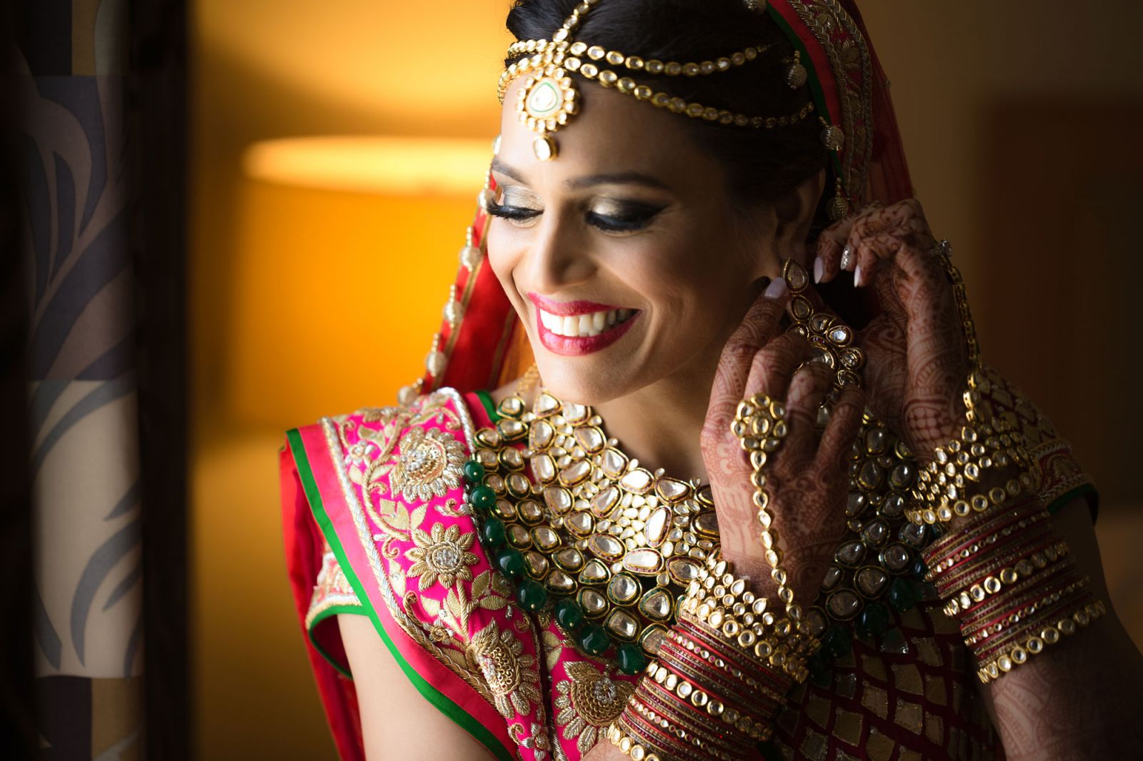
Less Editing, Truer Color: Making White Balance a Habit
Mastering white balance photography pays off every time you import a card. When you “get the color right in camera first,” the best editing decision you make is needing less of it. Instead of pushing sliders hard to rescue bad color, your editing becomes lighter: small tweaks, local adjustments, and perhaps a subtle creative shift rather than full-blown lighting color correction.
This also saves you from one of the biggest traps: overediting color. Grabbing the global saturation slider and shoving it up often leads to muddy skin tones, neon foliage, and that plasticky, obviously edited look. Natural color in photography feels “alive,” not loud. When white balance and color temperature are handled well, your job in post‑processing is “to protect what’s already there and let it breathe,” not to manufacture color from scratch.
Is it worth the effort? Absolutely. A simple white balance routine adds seconds in the field and can save hours later. It keeps your work consistent, your files cleaner, and your colors closer to how the scene felt when you pressed the shutter. Pay attention to the light, use your camera white balance settings with intent, lean on Kelvin for fine‑tuning, and you’ll find that your favorite images are the ones that feel true, not the ones edited the hardest.