
Why Those Tiny Icons Decide How You Travel
Google Maps icons are visual signals that describe route efficiency, legal lane options, and the type of surface you see on the map so you can judge speed, fuel use, and conditions at a glance instead of deciphering raw directions or traffic data turn by turn.
If you ignore the icons, you let Google pick for you; if you decode them, you actively choose how you trade time, money and emissions. The green leaf marks a fuel‑efficient route and should save petrol or battery charge while cutting emissions. The HOV toggle can reroute you into faster high‑occupancy lanes where they exist, changing your ETA by several minutes. Blue lines, in different shades, distinguish waterways, your active route, and Street View coverage. In other words, Google Maps icons explained properly are less about decoration and more about control: they tell you whether you are optimising for speed, eco‑friendly routes, or clarity of what is actually on the ground.
The Leaf Icon: Eco-Friendly Routes, Not Always Faster
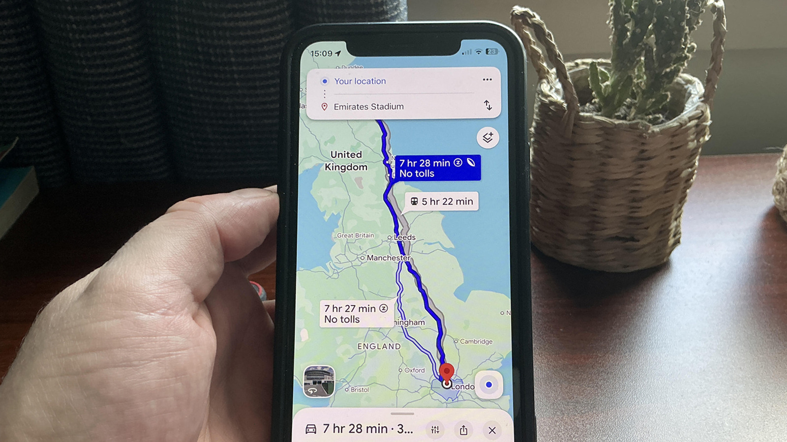
The leaf icon in Google Maps is a promise and a trade‑off. The leaf marks a fuel‑efficient route, and the app flags the most fuel or energy efficient option among alternatives for both petrol cars and EVs, with this feature enabled by default. It should save you fuel or battery charge and “should cut emissions”. That is the upside. The downside is time: these routes do not always prioritise the fastest arrival, so they can run longer than the quickest alternative.
Behind that little leaf is a fairly serious model. Google Maps pulls live traffic data to predict congestion, then layers in road types, junctions, layouts and even topography, because hauling a car uphill burns more energy than cruising on a flat highway. It estimates efficiency using insights from the US Department of Energy’s National Renewable Energy Laboratory and the European Environment Agency, tied to average vehicle consumption in your region. If you care about emissions, you should pick the route with the leaf when planning a trip. If “every second counts,” you should turn off Prefer fuel‑efficient routes under Settings → Navigation. And if you want the system to work in your favour instead of guessing, set your engine type under Settings → Your vehicles to petrol, diesel, hybrid or electric.
HOV Lanes: Legal Shortcuts for Shared Cars
If the leaf is about burning less, HOV is about waiting less. High Occupancy Vehicle (HOV) lanes are carpool lanes reserved for vehicles with multiple occupants or certain qualifying types, and Google Maps treats them as an optional fast lane in its navigation. When you enable Prefer HOV for a destination, Google highlights routes that support HOV driving and offers shorter time estimates and improved ETAs compared with general‑purpose lanes. In Google’s own example, turning on Prefer HOV cuts the ETA by about seven minutes on the same corridor.
To use HOV lanes navigation, you must opt in each time: enter your destination, tap Directions → More → Options, and toggle Prefer HOV on. A flag appears on the route card when the feature is enabled. While that flag looks like free time, it comes with responsibility. Google will not confirm whether you meet local HOV rules, how many passengers you need, or which vehicle types qualify. You are still on the hook for fines if you misuse those lanes. When you are not carpooling, turn the setting off to return to regular routing. Used correctly, HOV in Maps is a quiet power tool: it converts your willingness to share a ride into consistent, predictable time savings.
Blue Lines: Route, Water, or Street View?
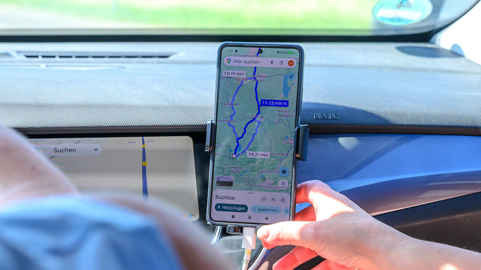
If the leaf and HOV icons change the route, the blue line changes how you read the map itself. The trouble is that “blue line Google Maps” does not mean one thing; it means several. Blue designates water on the map, whether it is a lake, sea, river, or canal. In some cities with grid‑like canals, those permanent blue lines can look suspiciously like roads, leading people to think they have discovered a secret shortcut when they are staring at a waterway.
On top of that base layer, Google adds overlays in other blues. A darker shade of blue is used during turn‑by‑turn navigation to show your active route; that is the thick line you follow as you drive. Then there is a teal‑like hue highlighting areas covered by Street View, the mode that lets you explore places through ground‑level imagery contributed by cars and users. Once you understand which shade of blue is baked into the map and which is an overlay, it becomes easier to see where you are driving, what is water, and where you can drop into Street View for virtual scouting. In short, not every blue line is a road, and mistaking them is a fast way to misread your options.
Take Control: Tune Your Icons, Tune Your Trips
The most underrated part of using Google Maps well is deciding how noisy the map should be. By default, the app leans towards eco‑friendly routes: the leaf is on, and the most fuel‑ or energy‑efficient route among alternatives is highlighted. That is a smart default if you value emissions savings, but a poor one if you are late for a flight. The fix is to treat settings as a dashboard, not a menu you visit once. Turn off Prefer fuel‑efficient routes under Settings → Navigation when time matters. Turn it back on when you want eco‑friendly routes and calmer driving.
The same applies to HOV lanes navigation. Prefer HOV is a toggle under Directions → More → Options, not a permanent mode. Use it when you qualify for carpool lanes and expect congestion, then disable it before solo commutes. If you want better eco routing, declare your engine type under Settings → Your vehicles so Google can tailor efficiency estimates to petrol, diesel, hybrid or electric cars. Once you know that blue shows water and navigation routes while teal highlights Street View coverage, those colours stop being noise and start being context. The conclusion is simple: stop treating icons as decoration. They are dials you can adjust to match your priorities—speed, efficiency, or environmental impact—on every single trip.